Getting Started
Why Your Watercolors Dry Lighter and How to Plan for It
Watercolor dries lighter than it looks wet. Here's why it happens and how beginners can plan for the shift from the first brushstroke.
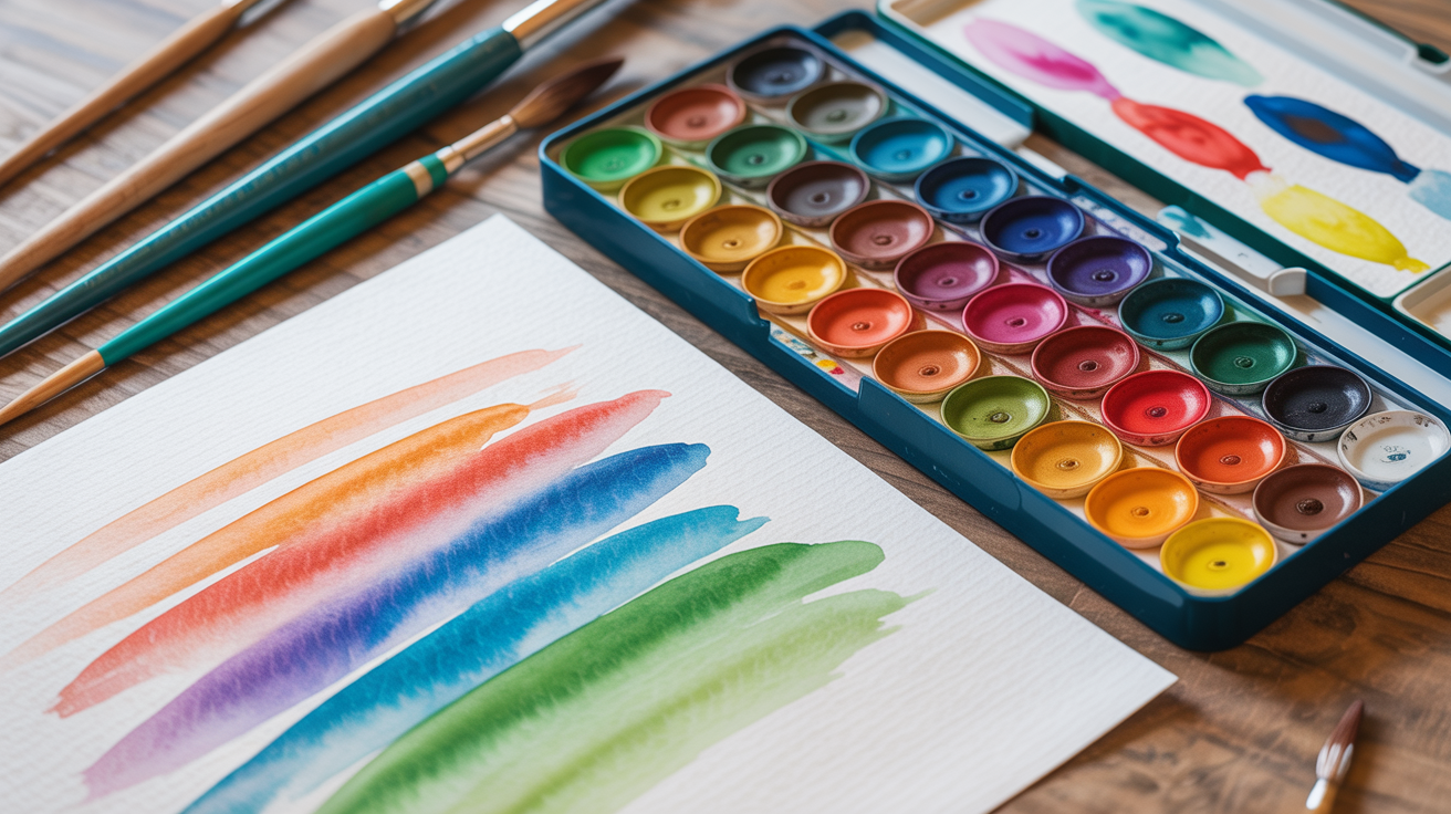
You paint a deep, juicy stroke of ultramarine, stand back, and think: that's the perfect blue. Then it dries and looks like someone watered it down. This is not a defect. Watercolor dries lighter than it looks when wet, every time, by somewhere between 20 and 30 percent. Once you understand why, you can plan for it instead of fighting it.
Why watercolor dries lighter
The short answer is water. When paint is wet, water fills the spaces between pigment particles and acts like a magnifying lens, making colors look richer and deeper than they really are. As the water evaporates, that optical boost disappears and you're left with just the pigment sitting on the paper surface. The color you see dry is the true color.
There's a secondary factor too: the paper. Wet watercolor paper reflects light differently from dry paper. While the sheet is damp, light scatters through the thin water film and amplifies the apparent saturation. Once dry, you're seeing pigment on matte paper fiber, which absorbs more light and appears less luminous.
This is not unique to cheap paints or rough paper. It happens with artist-grade tube colors on 140 lb cold-press. It's just how the medium works.
How much lighter, exactly?
The general rule is 20 to 30 percent lighter in value (meaning the tone shifts toward the lighter end of the scale). Granulating pigments like cerulean or ultramarine can shift a bit more because the particles settle into the paper texture and the textured surface reads lighter. Transparent, non-granulating pigments like phthalo blue or quinacridone rose tend to shift a little less. But assume the shift is happening with every color you use.
How to train your eye to see it
The fastest way to stop being surprised is to test your colors on scrap paper before committing to your painting. This takes two minutes and saves a lot of frustration.
Mix a wash, brush a stroke, wait for it to dry completely (not just damp, actually dry), and compare the wet and dry patches side by side. Do this for every new pigment you use. Over a few sessions, you'll start to recognize the shift before it happens.
A second habit that helps: look at the lightest areas of your wet painting and ask yourself whether they're light enough. If the answer is "maybe not," they probably aren't. The lights will get lighter when dry, but the darks will also get lighter. The whole value range compresses toward the pale end.
If you're not sure yet what value means in painting context, understanding watercolor values and how to work light to dark is worth reading before you go further. Getting your values right is the single biggest factor in whether a painting reads as convincing.
Practical strategies for compensating
You can't stop the shift, but you can compensate for it. Here are the approaches that actually work for beginners.
Mix darker than you think you need
This feels wrong at first. Your instinct is to match what you want the final color to look like, but you need to aim darker. If you want a medium-value wash, mix what looks like a medium-dark wash. If you want a dark shadow, mix something that looks almost too dark.
Think in paint-to-water ratios. A "tea" consistency (lightly tinted water) will dry to almost nothing. A "milk" consistency (opaque and creamy-looking) will dry to a light-to-medium wash. A "coffee" consistency (dark and rich) will dry to a proper medium-dark. For your deepest darks, you want heavy cream: thick paint with minimal water.
Do a value test strip
Before starting any painting, take a scrap piece of the same paper you're using and make a quick strip of swatches going from very diluted to very thick for your main colors. Let them dry. This gives you a dry-color reference to work from. It takes five minutes and is one of the most useful habits in watercolor.
Go back in with a second layer
Watercolor is a layering medium. If a wash dries too light, you can glaze another wash over it once it's completely dry. Each layer adds depth. This is the normal way to build value in watercolor, not a workaround. The key is letting each layer dry fully before adding the next one. Painting into a damp layer causes blooms and backruns (which are beautiful for loose work, but not when you want controlled depth).
Save your brightest whites from the start
Because everything shifts lighter, your whites need to be the actual white of the paper, protected from the beginning. Masking fluid, careful painting around shapes, or lifting while still wet are your tools. If you paint over a white area thinking "I can lighten it later," you mostly can't. For more detail on this, how to save the white of the paper in watercolor covers the techniques that work.
A quick comparison: what happens to different pigments
Some colors shift more than others. This table gives a rough sense of what to expect.
| Pigment | Dry shift tendency | Notes |
|---|---|---|
| Ultramarine blue | Moderate to high | Granulates; settles into texture |
| Phthalo blue | Low to moderate | Very transparent; strong tinting strength |
| Cerulean | Moderate to high | Granulates noticeably on cold-press |
| Burnt sienna | Moderate | Warm and predictable; good for testing |
| Raw sienna | Moderate | Similar to burnt sienna in shift |
| Quinacridone rose | Low to moderate | Transparent; holds value fairly well |
| Payne's grey | Moderate | Reliable for darks, but still shifts |
| Yellow ochre | Moderate | Earthy and forgiving |
| Hansa yellow | Moderate to high | Light pigment to start with; dries pale |
| Sap green | Moderate | Can look vivid wet, more muted dry |
None of these are predictable enough to skip testing. Use this as a starting point, not a guarantee.
Common mistakes beginners make
Most beginners make the same few errors with this lightening effect. Recognizing them in advance helps.
- Mixing to match the target color exactly when wet, then being confused when it dries pale
- Stopping after one layer when the painting looks "finished" while wet (it won't be once dry)
- Applying thin washes over areas that need to be dark, assuming they'll look stronger dry (they won't)
- Not testing colors on scrap paper first, so every dry result is a surprise
- Overworking a wash while it's drying, trying to darken it, which causes texture and streaks
That last one is worth its own note. While a wash is drying, there's a window where the paper looks almost dry but is still damp underneath. Adding paint in this window causes backruns: the new paint pushes into the old wash and creates a bloomed, cauliflower-shaped mark. If you want to add paint, either do it while the wash is clearly still wet and shiny, or wait until the paper is completely cool and dry to the touch. There's no safe middle.
If you're still getting comfortable with how much water to use in the first place, how much water to use in watercolor is a good companion to this article. Water ratio is connected directly to how light your dried wash will end up.
A simple exercise to lock in the concept
Try this before your next painting session. You need your paints, a brush, and a piece of scrap watercolor paper.
- Pick three colors: one warm (burnt sienna), one cool (ultramarine), one neutral (Payne's grey).
- For each color, paint four swatches in a row, going from very diluted to near-full pigment.
- Let everything dry completely (10 to 15 minutes, or use a hair dryer on low).
- Compare each swatch to what you remember it looking like wet.
- Note which colors shifted the most.
That's it. Do this once and you'll have a physical reference you can come back to. Do it with every new color you add to your palette and you'll never be surprised again.
Frequently asked questions
Does watercolor always dry lighter, or does it sometimes dry darker?
It almost always dries lighter, not darker. The water-as-lens effect only works one direction. A few specialty paints with metallic or luminescent pigments can behave differently, but with standard watercolors (including most student and artist-grade sets), you can reliably expect the lighter shift every time.
Why does my painting look great when wet and disappointing when dry?
Because you're seeing two different things. The wet painting is lit with a thin water film that boosts apparent saturation and value. The dry painting is what the pigment actually looks like on the paper. The fix is to mix darker from the start and to go back in with a second layer once the first is dry, rather than trying to get the final result in one wet application.
How do I know when the paper is dry enough to add another layer?
Touch the edge of the painted area with the back of your hand. If it feels cool at all, it's still damp. Watercolor paper holds moisture longer than you'd think. If you're in a hurry, a hair dryer on a low, cool setting speeds things up. Painting into a damp layer is a separate technique (wet-on-wet) and produces soft, blurry edges, which is sometimes exactly what you want but is not the same as layering for depth.
Will using more pigment right from the start fix the problem?
Partly. Using heavier paint ratios (less water, more pigment) does reduce the shift because there's less water doing the optical-boost work. But there's still a shift, and very thick paint can lift and reactivate when you layer over it, which creates muddy mixing. The most reliable approach is a combination: mix a bit darker than you need, let the first layer dry, and glaze a second layer if the value still needs to be deeper.
Is there a way to make watercolor not dry lighter?
Not really, not with standard transparent watercolors. Some artists add a tiny amount of gum arabic to the paint, which increases transparency and surface sheen and can slightly reduce the shift. But it also changes the paint's handling. For most beginners, the more useful path is to understand the shift, test your colors, and plan your values accordingly. The medium works with you once you stop expecting it to behave like gouache or acrylic.