Getting Started
How Much Water to Use in Watercolor: The Beginner's Biggest Question
Learn exactly how much water to use in watercolor with the milk, tea, and coffee consistency method for beginners.
There is no single "correct" amount of water in watercolor. The right amount depends on what you are trying to do. That said, there are three consistency levels that cover almost everything a beginner needs, and once you understand them, you will stop second-guessing every brushstroke.
Here is the short answer: more water gives you lighter, more transparent color; less water gives you darker, more opaque color. Your job is to choose the right consistency for each part of your painting, not to find some universal perfect ratio.
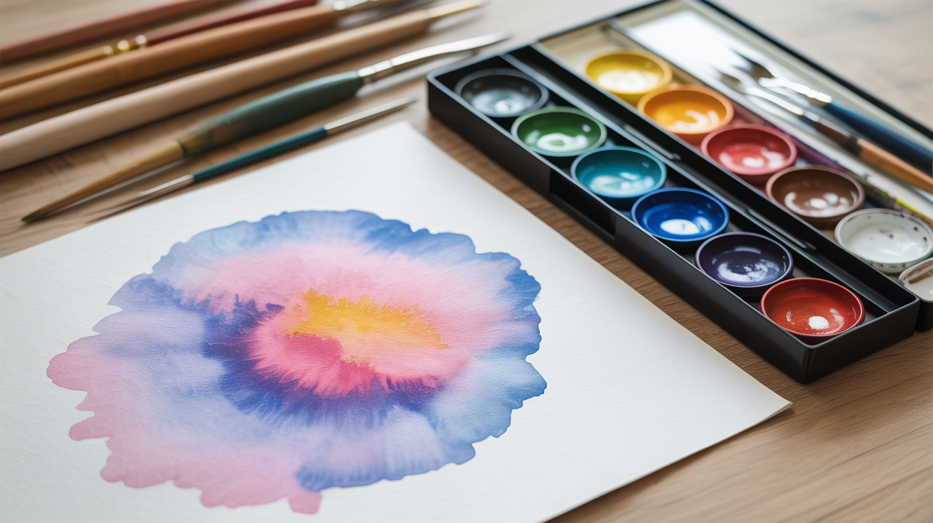
The milk, tea, and coffee system
The most useful way to think about watercolor consistency is to compare it to drinks you have seen a hundred times.
| Consistency | What it looks like | Water to paint ratio | Best used for |
|---|---|---|---|
| Tea | Very pale, nearly clear | ~10 parts water : 1 part paint | Light washes, backgrounds, glazing |
| Milk | Soft, translucent color | ~4-6 parts water : 1 part paint | General painting, flowers, skies |
| Coffee | Rich, saturated color | ~1-2 parts water : 1 part paint | Details, shadows, final layers |
These are rough guidelines, not chemistry. The exact ratio shifts depending on your specific paints, paper, and how dry your palette is. Trust your eyes more than any formula.
Tea consistency
Tea consistency is barely-there color. Hold your brush up to the light and you can almost see through the wash. This is what you want when you are laying a background, tinting a white area lightly, or glazing a soft layer over dried paint. A lot of beginners avoid this consistency because it looks too pale on the brush, but remember: watercolors dry 20-30% lighter than they appear wet, so the wet pooling on your paper that looks nearly invisible will actually leave a visible wash when dry.
Milk consistency
This is the workhorse consistency for most of your painting. It looks like skimmed or semi-skimmed milk on the brush: you can see the pigment clearly but it still flows easily. Ultramarine at milk consistency gives you a soft, floaty blue. Quinacridone rose at milk consistency is a warm, blushing pink. Most of the shapes and colors in a painting land here.
Coffee consistency
Coffee consistency is for the dark, punchy moments: shadows, foreground branches, lettering, fine details painted with a size 6 or smaller round brush. At this level the paint barely flows on its own. If you are trying to add crisp definition to a dried layer, this is the consistency you want. Go too wet here and you get blooms and unintended spreading, which is genuinely useful in some techniques but frustrating when you want control.
How to test consistency before you paint
Before you put a mark on good paper, do this: dip your brush, load some paint, then dab it on a scrap piece of paper or the edge of your palette. Let it sit for five seconds. If it fans out into a large watery puddle, it is too wet. If it sits stiff and barely moves, it is too dry. You are looking for something in between that flows when you encourage it but does not race off on its own.
A quick two-step test:
- Touch the loaded brush to your scrap paper and drag it about two inches without pressing hard.
- Lift the brush and look at the stroke. Smooth, with some sheen? Good. Streaky and gappy? Too dry. A growing puddle spreading past where your brush went? Too wet.
This takes maybe ten seconds and saves you from ruining a passage you spent twenty minutes building.
What happens when you use too much water
Using too much water watercolor is probably the most common beginner mistake. A few things go wrong:
- The wash floods and runs into areas you did not intend.
- You lose control of edges entirely.
- When it dries, you get a hard, uneven line called a bloom or cauliflower where the water pushed the pigment to the edges.
- Colors look washed out and flat, and adding more paint on top of a flooded wet area just makes things worse.
None of this is a disaster. Blooms can actually be beautiful, and plenty of painters use flood-and-drop techniques on purpose. But when you are trying to lay an even wash or paint a controlled shape, too much water is working against you.
The fix is simple: if your paper looks flooded, take a dry brush (or the edge of a folded paper towel) and gently lift out the excess water. Act fast, because once the surface starts to dry it becomes much harder to correct without leaving a mark.
What happens when you use too little water
Too little water means the paint does not flow properly. You get streaky, patchy marks, and if you try to go back over an area that is half-dry, you will get scratchy lines and disturbed pigment. Watercolor is meant to flow. If it is not flowing, add a little more water.
The other problem with under-watered paint is that it tends to look chalky rather than luminous. Part of what makes watercolor special is the way light bounces off the white paper through transparent layers of pigment. Very stiff paint sits on top of the paper rather than sinking in, and you lose that glow.
A good indicator that your paint is too dry: it is pulling and dragging as you draw the brush across the paper, rather than gliding. Add water and test again on your scrap piece.
Setting up two water jars (and why it matters)
Before any of this works well, you need two water jars, not one. One jar is for rinsing dirty pigment off your brush. The other holds clean water for mixing. This is a small thing that makes a real difference: if you mix your wash with murky rinse water, your colors will turn grey and muddy before you even start. The right supplies make water management much easier, and two jars is one of the most underrated items on that list.
Swap to fresh water in the rinse jar when it turns dark brown or murky. For a short painting session you might only need to change it once, but on a long day you might change it three or four times.
Practical tips for getting water right from the start
A few things that help while you are still building instinct:
- Load your brush from a palette well, not directly from the paint tube or pan. Palette wells let you control how much water you add.
- When in doubt, start wetter and add more paint. It is easier to deepen a too-pale area than to rescue one that has gone too dark too early.
- Keep a dedicated scrap piece of 140 lb (300 gsm) cold-press paper next to your painting. Test every new consistency before it hits your actual work.
- Bigger brushes (size 8 or 10 round, or a 1-inch flat) hold more water and are harder to over-load on accident. Smaller brushes feel more controlled but can dry out mid-stroke.
- Practice flat washes on scrap paper first. Painting a flat wash forces you to think carefully about consistency because an uneven ratio shows up immediately as streaks.
Getting comfortable with water takes a few sessions, not a few minutes. Give yourself permission to make muddy, flooded, over-dry messes while you are learning. That is how you develop the judgment that eventually becomes automatic.
Frequently asked questions
How do I know if my watercolor is the right consistency?
The fastest check is to test on scrap paper. Drag the loaded brush two inches across the paper without pressing. The stroke should flow smoothly with a slight sheen but not flood or spread past the stroke. If it looks like milk on paper, not like pond water, you are in good territory for general painting.
Can I fix watercolor that is too wet once it is on the paper?
Yes, but you need to act quickly before the surface starts to dry. Blot gently with a clean dry brush or the corner of a paper towel to lift excess water. Avoid rubbing, which disturbs the paper surface and leaves visible damage. If you act within the first 30-60 seconds, you can usually pull back a flooded area and continue painting.
Why does my watercolor look washed out even though I used a lot of paint?
Most likely the paint was still too wet. Water dilutes pigment, and a flooded wash can look nearly colorless when dry. Try the coffee consistency: load paint onto a slightly damp (not soaking) brush with very little added water and see how much richer the color becomes. Also check that you are working light-to-dark. Adding a darker layer over a dried pale layer is much more reliable than trying to go dark on the first pass.
Does the type of paper change how much water I should use?
Yes, noticeably. Heavier paper (140 lb / 300 gsm) handles more water before buckling and gives you more time to work. Lighter paper or sketch paper soaks through fast and buckles badly, which makes water management harder. Cold-press paper (the standard textured surface) absorbs paint slightly differently than hot-press (smooth), and granulating pigments like ultramarine or cerulean will behave differently on each. Start on cold-press 140 lb if you can; it is forgiving and is what most beginner instructions assume.
Is there a ratio I should memorize?
Not really. The milk, tea, and coffee descriptions are more useful than numbers because ratios vary depending on how wet your brush is, how dry your paint is, and how absorbent your paper is. Learn to read what you see: pale and flowing is tea, opaque and dragging is coffee, and most things in between are milk. Your eyes will calibrate faster than any formula.