Light, Value & Composition
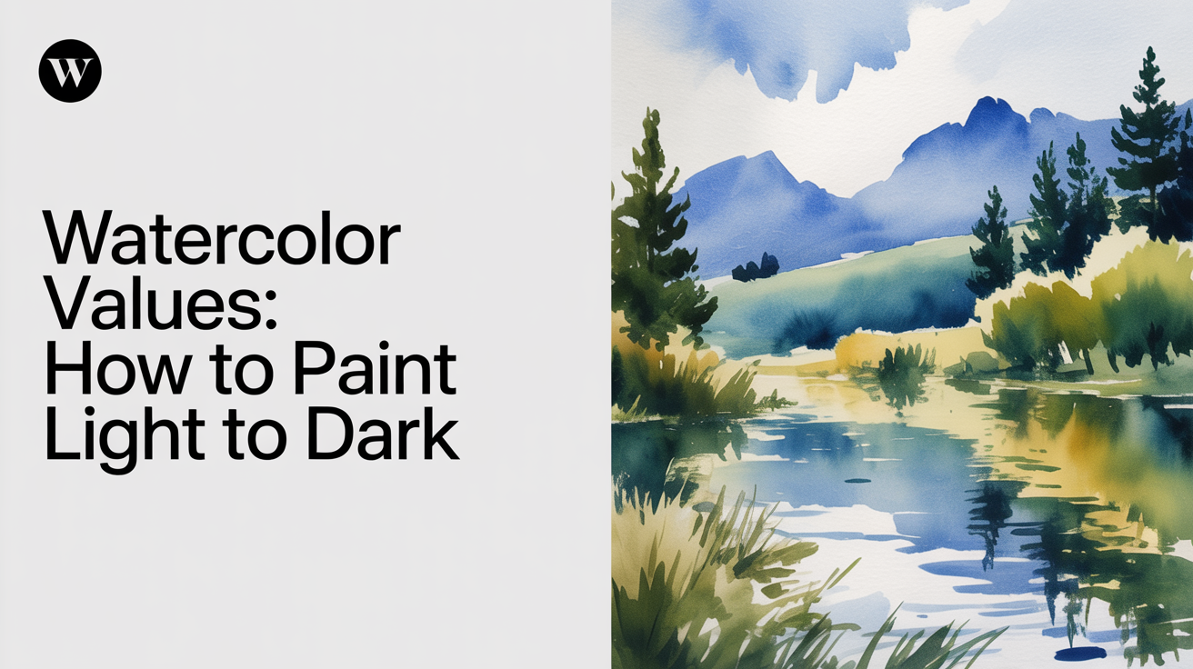
Watercolor Values: How to Paint Light to Dark
Master watercolor values with this beginner guide to light-to-dark painting, tonal value scales, and why value matters more than color.
Value is the single most important thing in a watercolor painting. Not color, not technique, not expensive supplies. Value. Once you understand how light and dark work together, your paintings will read clearly across the room, and you'll stop wondering why something looks "off."
This guide walks you through what value means in watercolor, how to train your eye to see it, and how to build a painting from light to dark in a way that actually works with the medium instead of fighting it.
What value means in watercolor
Value simply means how light or dark something is. Think of a black-and-white photograph. Every object in that photo has a value, from the brightest white highlight to the deepest shadow. Color is separate from value. A bright red and a medium green can share almost exactly the same value, which is why paintings with great color but poor value still look muddy and flat.
In watercolor, value is controlled by how much water you add to your paint. More water means a lighter, more transparent wash. Less water (and more pigment) means a darker, denser mix. That's the whole system. No white paint is needed to lighten a value in watercolor. You lighten by diluting.
This is genuinely different from oil or acrylic painting, where you add white to lighten. If you've worked in those media before, this is the adjustment that trips up almost everyone in the first few sessions.
Building a value scale
Before you touch a painting, build a simple nine-step value scale on a scrap of 140 lb (300 gsm) cold-press paper. Use a single pigment, something transparent like ultramarine or phthalo blue, so you can see the full range cleanly.
Here's how to build it:
- Draw nine small squares in a row with pencil.
- Leave the first square completely empty (the white of the paper is your lightest value, value 1).
- Mix a very thin wash, around milk consistency, and fill square two.
- Add a bit more pigment and fill square three.
- Keep increasing pigment and reducing water, one square at a time.
- For the darkest square (value 9), your mix should be nearly full-strength paint, the consistency of thin cream, with very little water.
Let each square dry fully before judging it. Watercolor dries 20 to 30 percent lighter than it looks wet, so your scale will shift toward the lighter end once everything is dry. This is not a defect. It is how the medium works, and once you know it, you start mixing slightly darker than you think you need.
Practice this scale a few times over a week. It sounds tedious, but it genuinely resets how your eye reads tonal values. Most beginners are working in a very narrow range (values 2 through 5) without realizing it.
Why light to dark is the only sensible approach
In watercolor, the paper is your white. You cannot paint over a dark area with white to recover a light. You can lift slightly when paint is wet, and some pigments lift more easily than others, but the safest and most reliable white in watercolor is the paper you never covered in the first place.
This means the entire logic of building a watercolor painting runs in one direction: light to dark. You begin with the lightest washes and add layers of progressively darker value as the painting develops. Every layer needs to dry before the next, or the edges will bloom uncontrollably.
This approach has real advantages. Because you start light, early mistakes are easy to work around. A wash that lands in the wrong spot at value 2 is rarely a disaster. A stroke of near-black in the wrong place is. Working light to dark also means the painting stays flexible and adjustable for most of the process, with the commitment coming only at the end when you lay in the darkest darks.
To protect specific light areas, you can save the white of the paper with masking fluid or careful painting around them. This is worth learning early, because chasing lights after the fact wastes time and often damages the surface.
How to compare values before you paint
One of the most useful habits a beginner can build is doing a quick value check before committing paint to good paper. There are a few simple methods.
Squint at your reference. Half-closing your eyes blurs the color information and lets you see the broad value pattern underneath. If you can't tell whether a shadow is darker than a midtone, squint harder. The difference will usually become obvious.
Photograph in black and white. Take a photo of your subject or reference image and convert it to grayscale on your phone. Most phones have a filter for this built into the camera or photo editor. What you're left with is a pure value map of the scene. Paint that, and color almost takes care of itself.
Make a thumbnail value study. Before you paint full-size, spend five minutes doing a tiny (2 x 3 inch) sketch with just three values: light, middle, and dark. This forces you to simplify and commit to a value structure. It's faster than it sounds, and it prevents the most common mistake, which is treating every area of equal importance. A quick value study before you paint can save a half-hour of rework on the main piece.
A quick value comparison table
| Value range | Mix consistency | What it looks like dry |
|---|---|---|
| 1 (lightest) | Bare paper | Pure white |
| 2 to 3 | Milk | Very pale tint |
| 4 to 5 | Weak tea | Clear midtone |
| 6 to 7 | Strong tea | Noticeable depth |
| 8 to 9 (darkest) | Thin cream | Near-black |
Common value mistakes beginners make
Knowing what to avoid saves a lot of frustration. These are the patterns that come up again and again.
Everything the same value. The finished painting looks flat because there is no contrast to create depth or focus. This usually happens when a beginner is afraid of going dark. The fix is to commit to genuine darks in at least a few areas, especially in shadows and foreground elements.
Darks added too early. Laying in a dark value before the surrounding layers are dry creates uncontrolled blooms. These are sometimes beautiful, but they are rarely where you intended them. Patience with drying time solves this entirely.
Lifting and scrubbing wet paint. When something goes wrong, the instinct is to scrub. Scrubbing damages the paper surface and leaves a pale, rough patch that catches every subsequent layer differently. A better move is to blot with a clean damp brush or tissue while the paint is still very wet. Once it dries, leave it alone unless you have a compelling reason to lift.
Mixing color without checking value first. A beginner might mix a lovely color but never check whether its value is right for that area. An easy check: mix the color, then photograph it next to your reference (or squint). If the value matches, the color usually works.
Ignoring the value of reflected light in shadows. Shadows in real life are rarely a single flat dark. They often contain reflected light, making them lighter in some areas than others. A beginner who paints all shadows as one flat wash loses a lot of the three-dimensional quality that makes a painting feel real.
Putting values to work in an actual painting
Here is a basic sequence that works for most simple subjects (a piece of fruit, a simple landscape, a ceramic mug).
Start with a light overall wash that maps out your light source. Then drop in your midtones while that wash is still slightly damp or fully dry, depending on whether you want soft or hard edges. Soft edges come from wet-into-wet; hard edges come from painting on dry paper. Both have a place, and understanding soft vs hard edges in watercolor will help you use value contrast even more effectively.
Finally, once everything is dry, lay in your darkest values. These anchor the painting. They create the contrast that tells the viewer where to look. They can be added selectively, in small amounts, and they do more work per square inch than any other part of the painting.
Do not try to blend everything smoothly. Watercolor naturally creates gradations when wet washes touch each other, and that quality is part of its appeal. Let it work.
Frequently asked questions
How many values do I actually need in a painting?
Three is enough to start. Light, middle, and dark. Many accomplished watercolor painters work with just five to seven distinct values in a finished piece. The goal is not a complete nine-step scale in every painting; it is enough contrast between your lightest lights and darkest darks to create depth and focus. Beginners tend to underuse the full range, staying in the middle values and wondering why the result looks timid.
Can I make watercolor darker after it dries?
Yes. Glazing, adding a transparent wash over a dry layer, is one of the core techniques in watercolor. It darkens the value and can also shift the color. The key is to let the underlying layer dry completely before glazing over it. If you go back too soon, the layers mix and you lose clarity. Transparent pigments like quinacridone rose, ultramarine, and phthalo blue glaze cleanly. Opaque or granulating pigments like cerulean can look chalky when layered heavily.
Why does my watercolor look so much lighter once it dries?
Because it is lighter. Watercolor dries 20 to 30 percent lighter than it appears wet, sometimes more on very absorbent paper. This is not a defect and it does not go away. The fix is to mix slightly darker than you think you need and to practice reading your wet washes at the moment of application rather than judging them while they are still glossy. Over time, your eye calibrates and you start compensating automatically.
What pigment is best for learning value?
Single-pigment earth tones are ideal for value exercises because they behave predictably and stay clean across the value range. Raw sienna, burnt sienna, and payne's grey are all good choices. Payne's grey in particular can take you from an almost-white tint at high dilution down to a near-black at full concentration. Avoid mixed-pigment darks (like Payne's grey or ivory black blends from student ranges) until you understand how your specific paints behave, because some shift color significantly as they dry.
Is value more important than color in watercolor?
For a beginner, yes, by a wide margin. A painting with correct values but slightly off colors will read as convincing and well-observed. A painting with gorgeous color but no value structure will look flat and confusing, no matter how carefully the colors were mixed. Get your values right first. The colors will follow, and when they don't, the painting usually still holds together.