Light, Value & Composition
How to Do a Quick Value Study Before You Paint
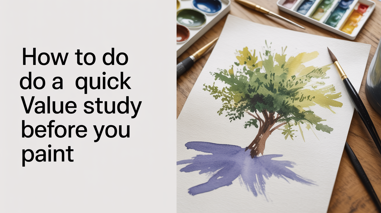
A value study watercolor sketch takes five minutes and saves your painting. Here's exactly how to do one before you pick up a brush.
Before you mix a single color, spend five minutes making a tiny black-and-white sketch of your scene. That's a value study, and it's the single habit that most reliably separates a painting that works from one that falls flat. You're not trying to draw beautifully. You're just figuring out where the lights and darks go.
What "value" actually means
Value is the lightness or darkness of a color, independent of what hue it is. A bright yellow and a pale lavender can share the same value. A deep navy and a rich burgundy can too. When beginners struggle with a painting that "looks muddy" or "feels flat," the problem is almost always value rather than color.
Watercolor makes this extra tricky because everything looks darker wet and dries 20 to 30 percent lighter. A wash that looks right on the brush can surprise you when it dries. Sorting out your value plan before you start means fewer surprises mid-painting.
A useful mental shortcut: squint hard at your reference photo or scene until your eyes blur. Colors disappear and you're left with just lights and darks. That's what you're capturing in a value study.
The simplest approach: a two-value thumbnail sketch
Start here if you're new to this. You need only a pencil (or a single dark marker) and a small piece of scrap paper. Cut or draw a rectangle about the size of a playing card. That small format is intentional: it keeps you from fussing over detail.
Squint at your subject and divide everything into two groups.
- Light shapes: the paper, the sky, sun-hit areas, anything pale. Leave these blank.
- Dark shapes: shadows, trees, the dark side of a building, any dense forms. Fill these in solidly.
The result looks almost like a silhouette study, and it should feel a little crude. That's fine. You're not making art; you're making a map.
This two-value approach has an old name: notan, from a Japanese concept meaning "dark and light." A notan study asks only one question: do my lights and darks make a readable pattern? If you cover the thumbnail and then look at it from across the room, a strong notan reads clearly. A weak one looks like scattered spots with no clear center of interest.
Moving to three values (and why that's usually enough)
Once a two-value sketch feels comfortable, add one middle tone. Now you have:
- White (the bare paper or lightest light)
- A mid-grey (fill with light pencil pressure or a diluted wash)
- Dark (full pressure or a rich wash)
Three values handle almost every painting subject you'll encounter as a beginner. Portrait? Lights, shadows, and mid-tones. Landscape? Sky, land, and dark foliage. Still life? Highlight, local color in middle light, and cast shadows.
You can do a three-value thumbnail in pencil, but a quick watercolor version with Payne's grey or neutral tint is even more useful because it mimics the medium you're about to use. Try a 1:5 paint-to-water ratio for your mid-tone and a thick, "coffee"-consistency mix for your darks.
Making a simple value scale
A value scale is a strip of five to seven boxes going from white to near-black. You paint each box a step darker than the last. Making one takes about ten minutes and teaches your hand what "mid-tone" actually feels like in watercolor.
Tape a strip of 140 lb cold-press paper, draw five rectangles, and fill them in order from lightest to darkest using Payne's grey. Let each box dry before judging it (wet watercolor lies). A typical beginner mistake is making steps 2 and 3 too similar. Space them out more than feels right.
How to do a value study in watercolor specifically
If you want to go beyond pencil and practice the actual medium, a watercolor value study thumbnail is worth doing. Here's a simple process:
- Draw a small rectangle (3 x 2 inches works well) on scrap 140 lb paper.
- Wet the paper lightly if you want soft edges inside the study.
- Mix two puddles of Payne's grey: one diluted to a pale wash (the "tea" consistency), one thick and dark (the "coffee" or darker consistency).
- Block in your lightest areas first by simply leaving the paper white. Watercolor can't undo.
- Drop in the mid-tone wash over anything that isn't your lightest lights.
- Once dry, add darks with the thicker mix.
The whole study should take five to ten minutes. Speed is actually a feature, not a shortcut. Slow, fussy value studies lead to overworked paintings.
Payne's grey is ideal for this because it's slightly cool and neutral, and it doesn't stain much, which means it's forgiving on rough paper. Some painters prefer raw umber for a warmer feel. Either works. The point is using a single color so you're not distracted by hue.
Practicing painting light to dark is a lot easier when you've already mapped where the darks should land before a drop of color goes on your good paper.
Common beginner mistakes in value studies
Making everything mid-range. This is the most common problem. If you look at your thumbnail and everything is roughly the same grey, there's no contrast and the painting will look timid. Push your darks darker. Really go for it on the thumbnail; save caution for your final piece.
Skipping whites. Beginners often paint over areas that should stay white. A value study forces you to decide in advance which lights to protect. That feeds directly into saving the white of the paper in your actual painting.
Spending too long on the study. Five to ten minutes, not thirty. If you're rendering texture in your thumbnail, you've slid into a different exercise. The goal is pattern, not detail.
Drawing too large. A 3 x 2 inch rectangle feels absurdly small. That's the point. Small thumbnails force you to think in big shapes.
Stopping after one study. Do two or three variations. Move your horizon line. Try a different arrangement of darks. One quick sketch rarely gives you the full picture. The act of doing three in a row is fast and usually one of them will clearly outperform the others.
Connecting value studies to edges
One extra thing your value study reveals: where you want hard edges and where you want soft ones. Where dark meets light sharply, you'll get a hard edge, which draws the eye. Where two similar values meet, the boundary softens and recedes.
This is useful information before you paint. A sharp edge in the wrong place (say, around a background tree when your subject is a figure in the foreground) can steal attention from your focal point. A value thumbnail makes these choices visible before paint is committed to good paper.
Once you've locked in a value plan, thinking through hard vs. soft edges during the painting itself becomes much simpler because you already know which areas should demand attention and which should fade.
Frequently asked questions
How small should a value thumbnail be?
Aim for roughly the size of a playing card, so 2.5 x 3.5 inches or smaller. That forces you to work in big shapes rather than details. If your thumbnail is bigger than a postcard, you're likely spending too much time on it.
Can I do a value study digitally?
Yes. A quick desaturated photo edited in brightness layers works fine as a reference. But doing it by hand, even in pencil, teaches your eye in a way that looking at a screen doesn't quite replicate. Both are valid; hand studies build a skill, screen studies save time.
Do I have to use Payne's grey?
No. Any single dark pigment works. Burnt sienna gives a warm study, ultramarine gives a cool one. Some painters use a soft graphite pencil with no water at all. The important thing is using only one hue so color doesn't distract you from value.
How many values should a beginner aim for?
Three is the practical answer. White, a clear mid-tone, and a genuine dark. Five-value scales are great for training your eye, but three well-separated values will carry most paintings further than beginners expect.
Does every painting need a value study?
Not every single one. Small practice pieces, loose gestural exercises, and 10-minute sketches don't usually need a formal study. But for anything you care about finishing, a five-minute thumbnail is almost always worth it. The number of times a quick study has saved a painting from a bad composition choice is hard to overstate.