Washes & Techniques
Watercolor Glazing: Building Color in Thin Layers
Learn watercolor glazing step by step: how to layer transparent washes to build depth, richness, and glow without muddying your colors.
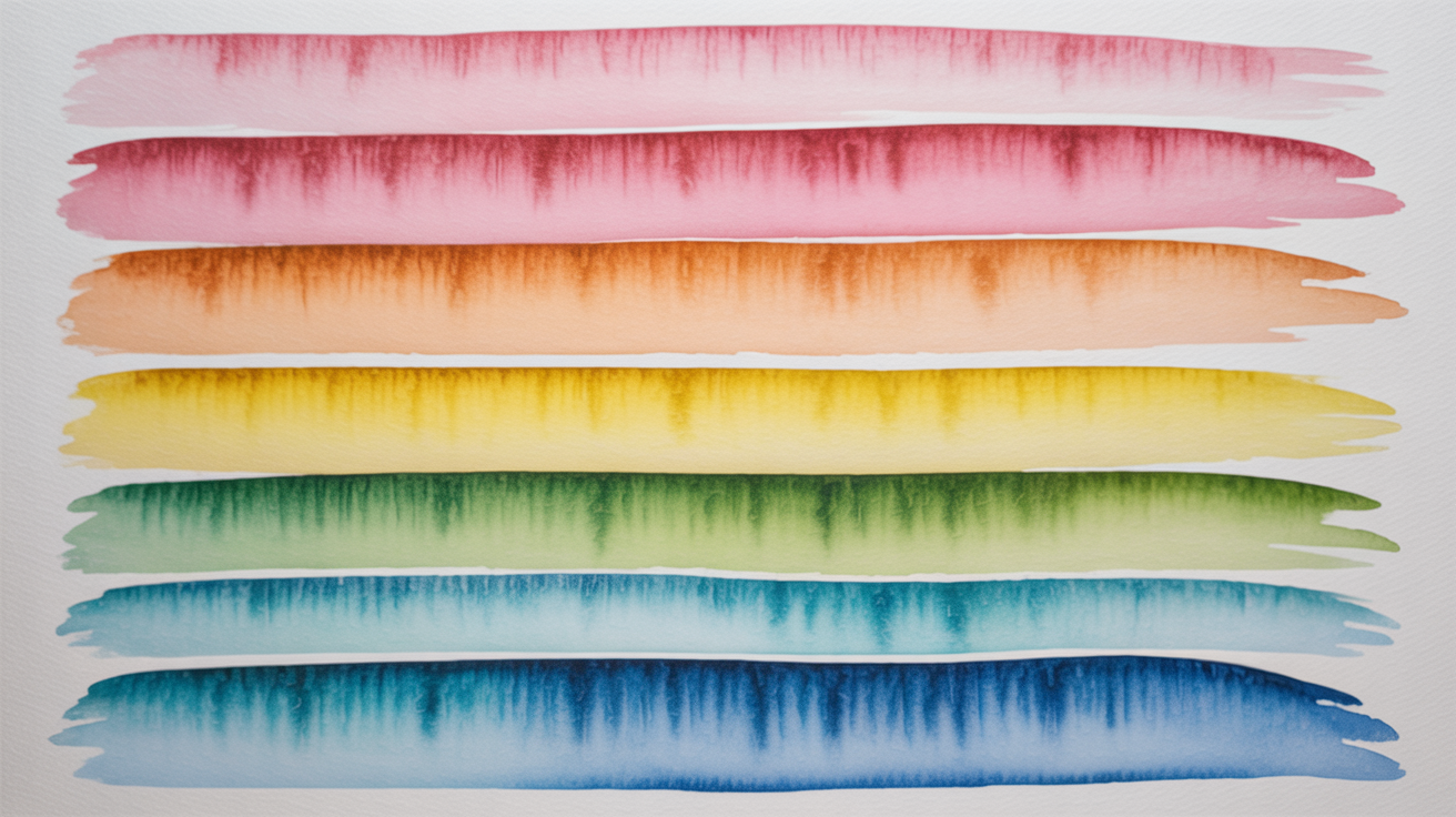
Watercolor glazing means painting one thin, transparent wash over a completely dry layer to slowly build up color, depth, or shadow. Each layer modifies what is underneath rather than covering it, so light can still bounce off the white paper and back through all the paint. The result is a luminous quality that thick, opaque paint cannot produce. If you have ever wondered how painters get those deep, glowing shadows or rich jewel tones, this is usually the answer.
What Makes a Glaze Different from a Regular Wash
A glaze is just a wash applied on top of dried paint. What makes it a glaze is the intent: you are adding a translucent film to change the color or value of what is already there, not laying down a base.
A standard wash goes onto dry paper or wet paper and sits on its own. A glaze goes onto a previous layer that has dried fully and relies on that earlier layer to show through. The transparency of the pigment determines how much the glaze shifts the underlying color.
Some colors glaze beautifully because they are inherently transparent: quinacridone magenta, phthalo blue, Prussian blue, burnt sienna, and most yellows. Opaque pigments like cadmium yellow, Naples yellow, or cerulean blue can still be diluted into a semi-transparent glaze, but you lose some of that luminous glow. Checking the transparency rating on your tube (usually a small open or filled square on the label) is worth doing before you commit to layering.
If you want to practice the basics before glazing, building your flat wash control first will help. See how to paint a flat wash in watercolor step by step for the fundamentals.
The One Rule That Matters: Wait Until Bone Dry
The most common glazing mistake is jumping to the next layer too soon. If the first wash is even slightly damp and you paint over it, the new wet pigment disturbs the surface, edges bloom, and colors blend into mud instead of stacking cleanly.
"Dry to the touch" is not dry enough. Watercolor paper can feel dry on the surface while the inner fibers still hold moisture, especially on heavier cotton papers. Tips for making sure:
- Hold the paper up near a window or lamp at an angle. Wet paper has a faint sheen; bone-dry paper is fully matte.
- For a single wash on 140 lb paper in a warm room, ten to fifteen minutes is often enough. On humid days or with heavy washes, wait longer or use a hair dryer on a low, cool setting.
- Touch the back of the paper. It should feel cool and smooth, not slightly tacky.
Rushing this step is the single biggest source of frustration with glazing technique in watercolor, and it costs almost nothing to just wait.
How to Build Layers Step by Step
The general process is simple: paint a wash, let it dry completely, paint another wash over it, repeat.
Start lighter than you think you need to. Glazing is additive. You can always add another layer to darken, but you cannot lift a glaze cleanly without disturbing the layers underneath. Begin at about half the value you ultimately want.
Mix enough paint before you start. Running out of a mixed color mid-glaze and having to remix while the wash dries will give you a visible stripe or hard edge. Mix more than enough.
Apply the glaze in one confident pass. Load your brush fully and work in one direction, just as you would a flat wash. Going back over a glaze while it is still wet will lift the layer underneath and create patches. If you need to cover a large area, work in strips without backtracking.
Keep your brush light on the paper. Heavy scrubbing pressure activates the dried layer beneath and drags it into the new glaze, muddying both. Let the water in your brush do the work, not the bristles.
Between two and four layers is a reasonable range for most beginner projects. More layers than that require very transparent pigments and very light individual washes, or the painting starts to look heavy and dull.
For building gradual transitions with multiple layers, how to paint a smooth graded wash covers the foundational technique that glazed gradients build on.
Using Glazing to Change Color Temperature
One of the most practical uses of glazing technique in watercolor is adjusting color temperature after the paint has dried.
If a shadow area looks too cool and blue, a thin glaze of raw sienna or yellow ochre over it pushes it toward warmth. If a warm orange passage reads as too hot or flat, a glaze of dilute violet or blue-gray cools it and adds depth.
This approach treats individual layers as color filters. Because each glaze is transparent, the original color is still present underneath, just modified. That is why the result often looks more complex and alive than a single mixed color would.
A useful habit: paint your lightest, warmest areas first. Darker glazes added later can build shadows and cool tones without ever touching the light zones. This keeps highlights fresh without needing to mask or scrub.
| Starting Layer | Glaze Added | Resulting Shift |
|---|---|---|
| Warm yellow | Transparent orange | Richer, deeper ochre |
| Mid blue | Thin quinacridone violet | Cooler, deeper blue-violet |
| Raw sienna | Dilute phthalo blue | Earthy neutral-green |
| Pink | Thin burnt sienna | Warm, sandy skin tone |
| Pale cerulean | Thin Prussian blue | Deep, cool blue |
Wet-on-Wet vs. Glazing: Knowing Which to Use
Glazing always happens on dry paper (wet on dry). The edges are firm, the layers stay separate, and you have control over where each wash lands. Wet-on-wet painting, where you drop color into a wet surface, gives you soft, diffused edges and unpredictable blooms.
Most paintings use both. A common approach is to block in soft, atmospheric areas with wet-on-wet watercolor soft blends while the paper is wet, let everything dry, then add structure, depth, and sharper definition with glazes on top. The two techniques complement each other well.
Frequently Asked Questions
How many layers can you glaze in watercolor? There is no fixed maximum, but most painters find that beyond four or five layers the painting starts to lose the freshness and luminosity that makes glazing useful. Using very transparent pigments in thin washes extends this range. If you are unsure, stop and assess before adding another layer.
Do I have to use professional paints to glaze? No, but transparent pigments work better than opaque ones. Student-grade paints in transparent pigments like quinacridone or phthalo hues will glaze reasonably well. Opaque student colors are harder to glaze because they scatter more light and can make layers look chalky.
My glaze keeps lifting the layer underneath. What am I doing wrong? The most likely cause is that the previous layer was not fully dry, or your brush pressure is too heavy. Make sure the earlier wash is bone dry, use a soft brush, and float the new wash on gently without scrubbing. Some pigments are also more prone to lifting than others; staining pigments like phthalo blue hold the layer underneath better than fugitive or non-staining colors.
Can I glaze with any color? Yes, but with varying results. Transparent pigments give you clean, glowing glazes. Semi-transparent pigments work with care. Opaque pigments used as glazes can produce a slightly chalky, veiled result rather than a luminous one. Experimenting on a scrap of the same paper before committing is always worth doing.
What paper is best for glazing? Cotton papers take multiple glazes better than wood-pulp papers because the surface holds up to repeated wetting without pilling or breaking down. Cold-press texture (medium grain) is the most common choice. If you are new to glazing, avoid very smooth hot-press paper at first because it shows every brushstroke and lifts more easily.