Getting Started
Watercolor for Absolute Beginners: How to Start in One Afternoon
Learn watercolor for beginners with this hands-on afternoon guide: what to buy, how to mix, and your first three exercises.
You can go from zero to your first real painting in a single afternoon. Watercolor has a reputation for being fussy and unpredictable, but that reputation is mostly earned by people who started with the wrong materials or skipped a few fundamentals. Get those right and the medium rewards you almost immediately.
This guide covers exactly what to buy, how to set up, and what to actually do in your first session. No art school vocabulary, no expensive kit. Just enough to get moving.
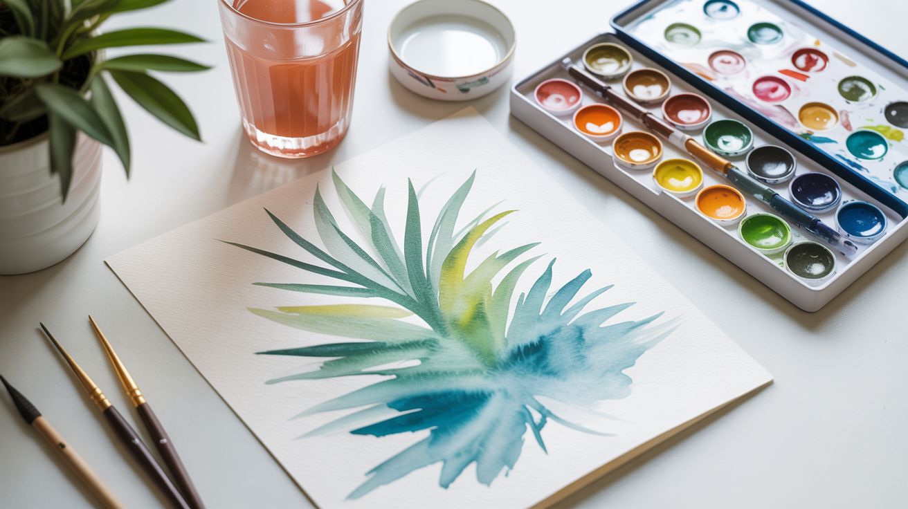
What you actually need (and what to skip)
The most common beginner mistake is buying too much. A full 24-pan set, a dozen brushes, and a jumbo watercolor pad sounds like a good start. It usually leads to decision paralysis and wasted money.
For a first afternoon, you need:
- Paper: One pad of 140 lb (300 gsm) cold-press watercolor paper. Cheap copy paper will buckle and fight you. The weight matters. Arches, Fabriano, and Canson all make reliable student-grade pads. Loose sheets are fine too.
- Paints: A tube set of 6-12 student colors, or a small pan set. Cotman (Winsor & Newton) or Van Gogh are good starting points. Avoid the $3 craft-store sets with muddy, low-pigment colors.
- Brushes: A size 8 or 10 round brush and a 1-inch flat. That covers 90% of beginner work. Synthetic is fine.
- Two water jars: One to rinse your brush, one to pick up clean water for mixing. Using a single jar turns everything gray by the second color.
- A palette: The lid of most pan sets works. A white ceramic plate does too.
That's the whole list. See the 5 things you actually need for your first watercolor painting for a longer breakdown with specific product links if you want to compare options before buying.
A note on paper quality
Paper makes a bigger difference than paint. Student-grade paints on good paper will outperform artist-grade paints on cheap paper every time. If you're going to splurge anywhere, splurge on the paper.
Setting up your workspace
Watercolor doesn't need much space, but a little preparation saves frustration.
Tape your paper down. Wet paper buckles badly, especially on lighter pads. A strip of painter's tape on each edge, or wet-stretching the sheet first, keeps it flat enough to work on. For a first session, taping works fine.
Fill both jars before you start. Set them on your non-dominant side so you won't knock them with your brush arm.
Squeeze or press out a small amount of each paint onto your palette. For tube paints, a pea-sized squeeze is plenty. Let them sit for a minute so they're not soaking wet when you pick up pigment.
Tilt your board slightly, about 10-15 degrees. This lets washes flow gently downward instead of pooling randomly. A stack of books under one edge is all you need.
Understanding water ratio: the key to control
Most beginners use too little water or too much, and they don't know which problem they have. The fix is thinking in terms of consistency rather than counting drops.
Three ratios worth knowing:
| Consistency | What it looks like | When to use it |
|---|---|---|
| Tea | Very light, almost transparent | Light washes, skies, soft backgrounds |
| Milk | Slightly opaque, flows easily | Most everyday painting |
| Coffee | Thick, rich, concentrated | Detail work, dark accents |
Start with more water than you think you need. You can always add pigment to deepen a mix. You cannot easily lighten a color once it's down on paper.
A useful test: mix a color and brush a stripe on a scrap piece of paper. Let it dry for 30 seconds, then look. Watercolor dries 20-30% lighter than it appears when wet, so if the stripe looks pale when dry, your "finished" painting will look washed out. Go richer than feels right. You'll get calibrated fast with a little practice.
For a full explanation of this, why your watercolors dry lighter and how to plan for it covers the science and some practical workarounds.
Three exercises to do in your first session
These are not drawings. They are technique exercises. The goal is to understand how the paint behaves, not to make something pretty.
Exercise 1: the flat wash
A flat wash is a single, even layer of color across a rectangular area. It sounds simple. It takes practice.
Mix a generous amount of a tea or milk consistency color, more than you think you'll need. Pick something you like: ultramarine blue, cerulean, raw sienna. Tilt your board slightly. Load your brush and make a horizontal stroke across the top of a rectangle you've drawn lightly in pencil. Then pick up the bead of paint that forms at the bottom of that stroke with your next stroke, pulling it across. Keep going down the rectangle, row by row, always picking up the bead.
The goal is even color with no hard lines between rows. You'll probably get some streaks. Good. Now you know what causes them (brush running dry, too much water, too little tilt) and you can fix them next time.
Exercise 2: the gradated wash
Same idea, but you're going from dark to light (or one color to another) as you work down the rectangle.
Start with a milk-consistency color. After every two or three rows, add a little clean water to your palette mix to lighten it slightly. By the time you reach the bottom, you should be painting near-clear water. The result is a smooth transition.
This is how most beginner skies and backgrounds are made. Practice it in blue, then try going from burnt sienna to yellow ochre for a warm sunset effect.
Exercise 3: wet-on-wet
Wet-on-wet is what gives watercolor its soft, blooming quality. It is also where beginners lose control and get frustrated, but knowing that it is supposed to be loose helps.
Brush clean water over a section of dry paper. Wait until it looks matte rather than shiny. Then load your brush with a milk-consistency color and touch it to the wet area. Watch what happens. The pigment will spread and feather. If you loaded it into a still-shiny area, it blooms more aggressively. If you wait until matte, it spreads more gently.
Try dropping two colors into the wet area and letting them merge on their own. Ultramarine and burnt sienna will make soft, granulating shadows. Quinacridone rose and phthalo blue will make interesting purples. Do not stir them. Let them mix on the paper.
Handling mistakes (and what watercolor can and can't fix)
Watercolor is more forgiving than its reputation suggests, up to a point.
While paint is still wet, you can lift color with a dry brush, a crumpled piece of paper towel, or a dry sponge. Press gently, don't scrub. This is how you recover a color that went too dark or pull out a highlight you forgot to save.
Once paint is dry, you can rewet and lift some of it, but not all. Staining pigments like phthalo blue and quinacridone rose are hard to remove. Granulating pigments like ultramarine and burnt sienna lift more easily.
The main thing beginners overdo is going back into a damp area to fix something. The brush picks up the wet paint and smears it. Let layers dry fully before adding more. A hairdryer on low heat speeds this up a lot. Twenty minutes of dry time between layers is not unusual with natural drying.
Working light-to-dark is the core rule. You cannot easily paint a light color over a dark one. Save your whites by painting around them or masking them with masking fluid before you start.
Your first real subject
After the three exercises, pick something simple. Not a landscape. Not a portrait. A single object.
A lemon works well. A mug. A piece of fruit. Something with a clear shape, a light source from one direction, and no more than two or three colors.
Sketch it lightly in pencil. Identify where the lightest areas are (those stay white or near-white paper). Paint the midtones first as a flat wash. Let it dry. Add shadows and darker areas in a second pass. One or two details at the end.
This is the entire watercolor process. Everything beyond this point is practicing those same steps with more complex subjects.
Frequently asked questions
Do I need to use expensive artist-grade paints to start?
No. Student-grade paints from brands like Cotman or Van Gogh are genuinely good. The main difference between student and artist grade is pigment concentration and lightfastness (how well the color resists fading over years). For practice work, student grade is fine. For paintings you want to keep, upgrading a few key colors like ultramarine, burnt sienna, and a good yellow to artist grade is worth it. You do not need to replace the whole set at once.
Why does my paper buckle so badly when I paint?
Water swells the paper fibers unevenly, and lighter paper buckles the most. The fix is using heavier paper (140 lb / 300 gsm minimum) and either taping it down before you start or stretching it. Stretching means soaking the paper in a tub of water for a few minutes, then stapling or taping it to a board while wet, and letting it dry flat before painting. It sounds like a chore but eliminates the buckling problem entirely.
How much water should I use?
More than you think, most of the time. Beginners tend to paint with too little water, which makes colors chalky and hard to blend. The beginner's guide to how much water to use in watercolor goes into this in detail, but the short answer is: if your strokes look dry or streaky, add more water to your palette mix.
Can I fix a painting that went wrong?
Sometimes. Wet paint can be lifted with a dry brush or paper towel. Dry paint can be rewetted and partially lifted, especially with less staining pigments. What you cannot fix is overworked paper that has started to pill or tear. Prevention is easier than repair: work quickly on wet areas, let layers dry before you add more, and keep a scrap piece of paper nearby to test mixes before they go on the painting.
What should I paint first?
Something you actually like the look of. The subject matters less than you think at this stage, because you are really practicing technique, not making finished art. That said, simple geometric subjects (a piece of fruit, a coffee cup, a smooth stone) are easier to handle than anything with complex edges or fine detail. Avoid portraits and human figures until you have a few sessions under your belt.