Light, Value & Composition
Simple Composition Rules for Better Watercolor Paintings
Learn practical watercolor composition rules for beginners: rule of thirds, focal points, and simple layout decisions that make paintings click.
A painting can have lovely color and smooth washes and still feel like something is off. Nine times out of ten, the problem is composition. Composition is just how you arrange the elements on the page, and a handful of simple principles can transform a muddy, restless painting into one that feels settled and satisfying. None of these rules require art school. They are practical tools you can apply before you pick up a brush.
What Composition Actually Means for Beginners
Composition describes every decision you make about placement: where the horizon goes, how big the main subject is, how much sky versus land to include. It also covers what you leave out.
Beginning painters often copy exactly what they see in front of them, placing the horizon in the center, the main flower dead in the middle, or the mountain filling the entire sheet. These instincts feel safe, but centered subjects tend to feel static. Slightly off-center arrangements create a quiet visual pull that leads the eye around the painting.
The good news is that composition decisions happen before a drop of paint touches paper. A two-minute pencil thumbnail or even a rough rectangle drawn in your sketchbook is enough to test an arrangement and avoid a costly mistake on good paper.
The Rule of Thirds
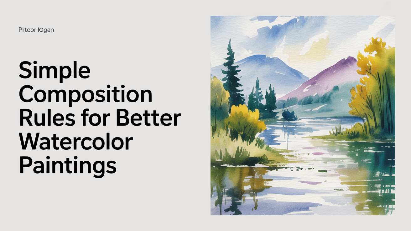
The rule of thirds is the single most useful composition tool for beginners. Divide your rectangle into nine equal sections with two vertical lines and two horizontal lines (like a tic-tac-toe grid). The four points where those lines cross are called power points.
Place your focal point near one of those four intersections rather than dead center, and the painting immediately feels more balanced. In a landscape, let the horizon sit on one of the horizontal thirds rather than through the middle of the paper. In a floral study, tuck the main bloom toward a top-left or top-right intersection and let smaller blooms trail away.
You do not need to be precise about this. Thirds are a general guide, not an exact measurement. "Near the upper left intersection" is close enough.
Choosing One Focal Point
A focal point is the part of the painting you most want the viewer to look at. Every painting needs one. When everything in a scene is equally detailed and equally bright, the eye has nowhere to land and the painting feels busy.
To establish a clear focal point:
- Give it the highest contrast in the painting (darkest dark next to lightest light)
- Make it the most detailed area while edges elsewhere stay softer
- Place it away from the center and away from the corners
- Keep nearby elements simpler so they support rather than compete
In a still life with three apples, one apple should be the star. Make its edge crisp, its shadow deep, its highlight saved or lifted. The other two apples can be looser, slightly behind, slightly less saturated. The viewer's eye will find the main apple immediately.
Understanding how light and dark values work together is key to making a focal point read clearly. Watercolor values explains how to control the value range across your painting so the focal point truly pops.
Directing the Eye with Lines and Shapes
After you have a focal point, you need a path that leads the viewer to it. This is sometimes called a "path of travel" or "eye flow." Natural lines in a scene do this work well: a road, a stream, a row of fence posts, the curve of a branch. You can also suggest a line with a progression of shapes, a gradient from light to dark, or a sequence of repeated colors.
A few practical arrangements:
| Arrangement | When to use it |
|---|---|
| S-curve or Z-path | Landscapes with a winding path or river leading to a distant focal point |
| Triangle of shapes | Still lifes and florals where three elements point toward each other |
| Frame within a frame | Windows, arches, or overhanging foliage that surround the main subject |
| Leading diagonal | A strong branch, shoreline, or shadow that pulls the eye from a corner inward |
Avoid lines that point straight off the edge of the paper, especially at corners. They act as exits that lead the eye away from the painting rather than through it.
Simplifying What You See
Composition for beginners is as much about subtracting as it is about arranging. A real scene almost always contains more information than a painting needs. A busy hedge, three overlapping buildings, a sky full of complicated cloud shapes: all of these compete for attention.
Before you draw anything, ask: what matters most? If the answer is a single oak tree at sunset, the hedge behind it can flatten into a simple mid-tone shape, the buildings can disappear entirely, and the sky can stay loose and clean. Your eye saw the whole scene, but your painting only needs the part that captured your attention.
A quick value study before painting helps clarify this. Squinting at a scene reduces the detail and shows you the large light and dark shapes. Those big shapes are your composition. The detail comes after. How to do a quick value study before you paint walks through this process step by step.
Handling White Space and Edges
White space in watercolor is not wasted space. Large quiet areas give the eye a place to rest and make the detailed focal-point area feel special by contrast. A busy painting with edge-to-edge detail is exhausting to look at. A painting with one area of clear activity surrounded by calmer passages feels intentional.
Think about your edges too. A subject that runs to the very edge of the paper can feel cramped. Leave a margin of space around important elements, even a small one, so they have room to breathe.
One planning trick: cut a simple cardboard viewfinder (just a rectangle cut out of a cereal box) and hold it up to your reference or scene. Move it around until one crop feels better than another. That crop is your composition.
Keeping whites bright through the painting process is a related concern. Wet paint has a way of drifting into areas you meant to protect. How to save the white of the paper in watercolor covers masking fluid, careful brushwork, and other techniques that keep those lights clean.
Frequently Asked Questions
Do I have to follow composition rules every time?
No. Rules are starting points, and breaking them on purpose can produce interesting results. But it helps to understand why a rule works before you decide to ignore it. Beginners often break rules by accident rather than by choice, which is how paintings end up feeling unsettled without a clear reason.
What if my subject naturally falls in the center?
You can shift your crop. Move slightly to one side, zoom in, or change your angle so the subject sits off-center. Even a small adjustment often makes the painting feel less static. If the subject must stay centered (a symmetrical arch or a reflected pond), lean into the symmetry fully and make the reflection or the pattern the entire point.
How detailed does my thumbnail need to be?
Very rough is fine. Three rectangles and a horizon line is enough to test whether the big shapes are working. You are not drawing the painting; you are testing the layout. Two minutes of planning at this stage saves far more time than reworking a painting that has gone in the wrong direction.
Can I change the composition once I have started painting?
Some adjustments are possible. You can simplify background shapes, deepen shadows to pull attention away from a problem area, or soften edges that are competing with your focal point. But major structural changes are hard to undo in watercolor, which is why thumbnails are worth the habit.
My focal point feels weak even when I follow these rules. What else can I try?
Check the value contrast. A focal point surrounded by similar values will not stand out even if it is in a good position. Push the darkest shadow right up against the lightest light in that area. This contrast is the single strongest signal that tells a viewer's eye where to look.