Subjects & Projects
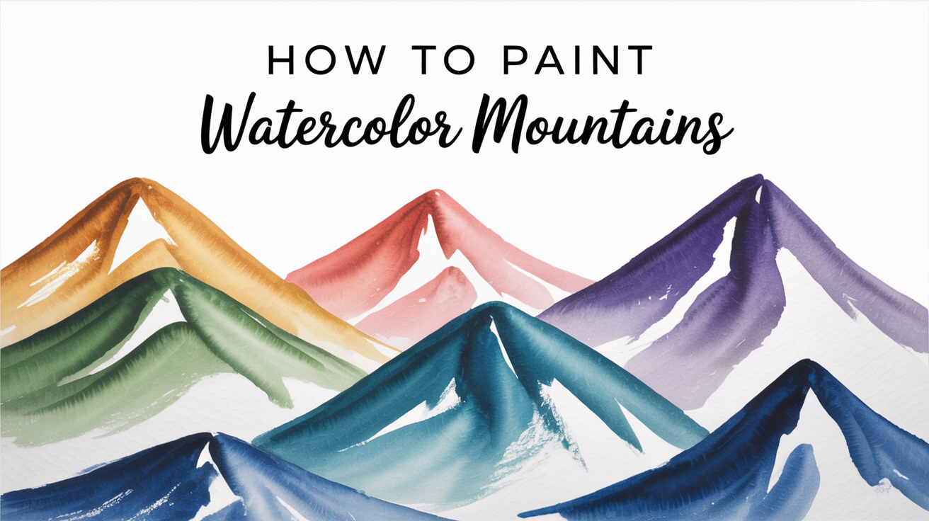
How to Paint Simple Watercolor Mountains
Learn how to paint watercolor mountains with simple shapes, layered washes, and soft edges. A beginner-friendly step-by-step mountain landscape tutorial.
Mountains are one of the most forgiving subjects in watercolor. Their shapes are bold and simple, the edges can be loose, and small "mistakes" in the wash often look like natural rock texture. If you have been waiting for a project to practice wet-on-dry layering and hard edges, this is it.
This guide walks through an easy mountains watercolor from blank paper to finished landscape, one step at a time.
What You Need
You do not need a full studio setup. A focused supply list keeps the focus on the painting, not the gear.
| Supply | What to look for |
|---|---|
| Paper | 140 lb (300 gsm) cold-press, at least 7 x 10 in |
| Paints | Ultramarine Blue, Burnt Sienna, and optionally a green (Sap Green or Hooker's Green) |
| Brushes | A 1-inch flat or large round for washes; a medium round (size 8-10) for shapes; a small round (size 4) for details |
| Water containers | Two, so one stays clean |
| Masking tape | To tape down the paper edges and keep a clean border |
Two colors are enough for a full mountain landscape watercolor. Ultramarine Blue makes the sky and cool shadows. Burnt Sienna adds warmth in the foreground and mixes with Ultramarine for soft greys and earth tones.
How to Plan Your Composition
Before mixing any paint, spend two minutes with a pencil sketching the basic horizon and peak lines.
Keep the composition in three zones:
Sky - the top third of the paper. Leave this mostly open so you have room to paint a simple watercolor sky and clouds as a background layer, or keep it a plain flat wash.
Mountains - the middle zone, with one large peak and one or two smaller ridges behind or in front of it. Overlapping shapes create depth.
Foreground - a simple strip of land, trees, or water at the bottom. You do not need to fill it with detail.
A common mistake for beginners is making all the mountain peaks the same height. Vary them. One dominant peak draws the eye; the others support it.
Painting the Sky and Background Wash
Tape your paper to a board and tilt the board slightly toward you (about 15 degrees). This keeps wet washes from pooling in corners.
Mix a wash of Ultramarine Blue with plenty of water. The color should look two shades lighter than you want the sky to be when dry.
Step 1. Wet the sky area with clean water using your flat brush. Keep the water just inside the pencil horizon line.
Step 2. Load your brush with the blue wash and sweep across the top of the wet area. Work from left to right, then repeat, pulling the color down toward the horizon. The wash should feather out softly near the mountain line.
Step 3. Let this dry completely. Patience here matters. If you add mountain shapes to a wet sky, the colors will bleed into each other and lose their edges.
Painting the Mountain Shapes
This is where a watercolor mountains tutorial differs from most other subjects. Mountains need hard, clean edges at the top (the ridgeline) and soft or blended edges elsewhere.
Mix your mountain color. Combine Ultramarine Blue with a small touch of Burnt Sienna to make a cool grey-blue. For the farthest peaks, keep it very diluted and light. Peaks that are farther away appear lighter and cooler in nature.
Paint the farthest range first. Load your medium round brush and paint the silhouette of the most distant ridge. Use the tip of the brush to follow the jagged peak line, then fill downward with the body of the brush. Work quickly so the lower edges stay soft. If you want a gradient inside the shape (lighter at the top, darker below), drop in a slightly darker mix at the base while the wash is still wet.
Let it dry, then paint the middle range. Mix a deeper version of the same grey-blue. Overlap the bottom of the first range slightly to push it back visually. The darker, more saturated color reads as closer.
Paint the foreground mountain last. Use the darkest, richest mix. You can add a hint of Burnt Sienna here to warm the rock and make it read as the closest plane.
For each shape, keep the top ridge line sharp and defined. That crisp edge is what makes mountains look like mountains.
Adding Simple Details and a Foreground
Once all mountain layers are dry, you can add texture and ground the composition.
A few things that take only a minute each but add a lot of presence:
- Snow line. Leave the paper white just below each peak, or lift color with a damp brush while the wash is slightly damp. You can also use white gouache as a finishing touch.
- Shadow side. Mix a darker version of your mountain color and paint the right or left face of each peak slightly darker to show which side is in shadow.
- Treeline. Tap the edge of a round brush loaded with Sap Green to create a rough tree silhouette along the base of the mountains. Keep it loose.
- Foreground wash. A flat wash of diluted Burnt Sienna or a warm green grounds the painting without competing with the mountains.
If you want to practice a more atmospheric landscape, the same layering logic applies to painting a watercolor sunset, where warm color builds up in similar overlapping bands.
For a change of pace after the mountains, try the wet-in-wet softness in loose watercolor flowers, which uses a completely different technique and makes a nice contrast exercise.
Common Problems and Fixes
The sky bled into the mountains. The sky was not dry before you added the mountain layer. Next time, wait until the paper feels room temperature to the back of your hand, not just the surface.
The edges look too soft and indistinct. You may be painting onto paper that is still damp. Let each layer dry completely, then paint the next shape onto dry paper for a hard edge.
My colors look muddy. Too many pigments mixed together, or the brush carried dirty water into the mix. Use two water containers and clean your brush between colors.
The paper warped and the wash pooled. Use heavier paper (140 lb or above) and tape all four edges to a board. Alternatively, pre-wet and stretch the paper the night before.
The mountains all look the same. Vary the size, height, and color temperature of each ridge. Farthest peaks: light and cool. Nearest peaks: dark and slightly warmer.
Frequently Asked Questions
What colors do I need to paint simple watercolor mountains? Two colors cover most mountain landscapes: Ultramarine Blue for the sky and cool shadows, and Burnt Sienna for warmth and earthy mixes. Mixed together in different ratios, they make a full range of greys and purples. You do not need a large palette.
Do I need to draw the mountain shapes first? A light pencil sketch helps beginners place the horizon and peak lines before painting. Use a soft pencil (HB or 2B) and draw lightly so the lines are invisible once covered by paint. If you prefer to paint freehand, start with the farthest, lightest range first so there is less pressure on the first marks.
How do I get a crisp ridgeline at the top of the mountain? Paint the mountain shape onto dry paper using a loaded brush with a good tip. Work the tip along the peak line, then fill the body of the shape below. The key is dry paper underneath, a loaded brush, and confident strokes rather than slow, hesitant ones.
Why does the background mountain look the same distance as the foreground one? Atmospheric perspective means distant mountains are lighter, cooler in color, and less detailed than close ones. Paint far ranges with a pale, diluted wash and almost no texture. Save your darkest, richest mixes for the nearest mountain.
Can I add white paint for the snow? Yes. White gouache or a white gel pen works well for snow highlights added at the end. Alternatively, plan ahead and leave the white paper bare in those areas from the start, which gives a cleaner look. Lifting wet paint with a damp brush also works if you catch it early.