Color & Mixing
The Beginner's Watercolor Color Wheel, Made Simple
Learn the watercolor color wheel from scratch: primary, secondary, and tertiary colors, plus mixing tips every beginner needs to know.
If you've ever squeezed out a pile of paint and then stared at it, unsure what to do next, the color wheel is the map you've been missing. It's not some theoretical art-school concept. It's a practical tool that tells you which colors mix cleanly, which ones go muddy, and which combinations will make your paintings sing. Once you understand the wheel, you'll stop guessing and start mixing with intention.
What a color wheel actually is
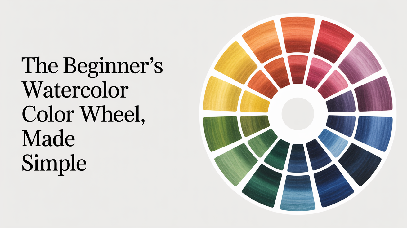
A color wheel arranges colors in a circle so you can see how they relate to each other. That's it. No mystery. The traditional wheel used in painting has twelve positions: three primaries, three secondaries, and six tertiaries that sit between them.
In theory, you only need the three primary colors to mix every other color on the wheel. In practice, watercolor pigments have their own personalities, and understanding that is what separates a muddy mess from a clean, glowing mix.
The three primaries and why they're tricky in watercolor
The primary colors are red, yellow, and blue. You can't mix them from anything else, which is why they anchor the whole system.
Here's the catch with watercolor: no single red, yellow, or blue paint is a "pure" primary. Every pigment leans slightly warm or cool. Ultramarine blue leans warm (toward violet). Phthalo blue leans cool (toward green). Cadmium yellow leans warm (toward orange). Hansa yellow leans cool (toward green). This affects every mix you make.
For building a basic color wheel as a beginner, these three paints work well:
- Yellow: Hansa yellow medium or cadmium yellow medium
- Red: Quinacridone rose or cadmium red medium
- Blue: Ultramarine blue
These three won't give you a perfect wheel (no three paints ever will), but they mix cleanly and give you a solid foundation. If you're curious about expanding beyond this trio, building a limited palette is a natural next step once you've got the wheel down.
Mixing the secondary colors
Mix any two primaries and you get a secondary color. There are three:
| Primary 1 | Primary 2 | Result |
|---|---|---|
| Yellow | Blue | Green |
| Yellow | Red | Orange |
| Red | Blue | Violet/purple |
On a 140 lb (300 gsm) cold-press paper, mix these in a clean well of your palette. Use a size 8 round brush and aim for a consistency like slightly watered-down milk. Start with the lighter color and add the darker pigment a little at a time. Ultramarine mixed with hansa yellow makes a reasonably clean green. Add more yellow for a bright spring green, more blue for a deeper forest tone.
The violet mix is where beginners often run into trouble. Ultramarine and quinacridone rose make a beautiful transparent violet. But if you try to mix a warm red (like cadmium red) with ultramarine, you'll get a muddy brownish purple. Cadmium red leans toward orange, and orange and blue together cancel each other out into grey. This is why the warm and cool primaries concept matters so much, even at the beginner stage.
Painting a simple color wheel exercise
This is worth doing before you ever attempt an actual painting. It takes about 20 minutes and teaches you more than reading could.
What you need:
- A sheet of watercolor paper (scraps are fine)
- Your three primary paints
- A round brush, size 6 or 8
- Two water jars (one to rinse, one to stay clean)
- A palette with individual wells
Steps to follow:
- Lightly pencil in twelve circles arranged in a ring. Three at the cardinal points (top, lower-left, lower-right) for the primaries, then fill in the gaps.
- Paint the three primaries first. Let them dry.
- Mix yellow and blue for green, paint it between them. Mix yellow and red for orange, and red and blue for violet. Let those dry.
- Now mix each primary with the secondary next to it. Yellow-green, blue-green, blue-violet, red-violet, red-orange, yellow-orange. These are your six tertiaries.
- Stand back and look at the whole thing before cleaning up.
Watercolor dries about 20 to 30 percent lighter than it looks wet. That's normal. If your colors look washed out when dry, they probably just need more pigment in the original mix.
Complementary colors and why they change everything
Colors directly across from each other on the wheel are called complements. Yellow and violet are complements. Red and green are complements. Blue and orange are complements.
Complements do two useful things. First, they vibrate when placed next to each other in a painting, creating visual energy. A red flower painted against a green background pops. A blue shadow on an orange still life glows. Second, mixing two complements together gives you a range of neutrals and muted tones. This is actually how you mix natural-looking greens without reaching for a tube of sap green, which often looks artificial straight from the tube.
A yellow-orange mixed with its complement (blue-violet) gives you warm, earthy tones, good for soil, rocks, aged wood. The more you lean toward one side, the more the color retains some of its original hue. The closer you get to 50/50, the more neutral and grey-brown the result. Experimenting with this on scrap paper will teach you faster than any color chart.
For mixing greens in particular, check out how to mix natural greens in watercolor. It goes deep on exactly this kind of complement-based thinking.
Common beginner mistakes with color mixing
A few patterns come up again and again when beginners first start working with the wheel.
Dirty water is the most common culprit for muddy colors. If your rinse jar is cloudy brown, your clean colors will pick up that tint. Keep one jar for rinsing and one that stays clear. Swap the rinse water whenever it gets dark.
Over-mixing on the paper is another habit to watch. Watercolor likes to be laid down and left alone. Scrubbing or stirring the brush while the paint is still wet lifts the paper fibers and creates texture you didn't intend. Mix in your palette, apply to paper, and step back.
Mixing too many colors at once produces mud fast. Two pigments usually mix cleanly. Three pigments often don't. If a color looks dull and grey when you expected something bright, count how many paints went into it. Fewer pigments generally means cleaner color.
Finally, don't mistake granulation for mud. Ultramarine blue, in particular, has large pigment particles that settle into the paper's texture and create a beautiful speckled effect. That's a feature of the pigment, not a mistake.
Frequently asked questions
Do I need to buy a set of every color?
No. You can mix a surprising range from just three primaries, or from a limited palette of six to eight paints. Buying a huge set often leads to paralysis at the palette. Start with a red, a yellow, a blue, and maybe a warm brown like burnt sienna. Get comfortable with those before expanding.
What's the difference between a warm and cool version of the same color?
Every primary exists in warm and cool versions. Ultramarine blue leans warm (toward red-violet). Phthalo blue or cerulean lean cool (toward green). Using the right version of a primary for the mix you're attempting means cleaner, brighter secondaries. Using the wrong version introduces a bit of the third primary, which moves the mix toward neutral or grey.
Why does my green always look muddy?
Most likely you're mixing a warm yellow with a blue that leans toward violet, or using a red-leaning blue when you need a green-leaning one. Phthalo blue mixed with hansa yellow makes a bright, almost electric green. Ultramarine mixed with the same yellow goes slightly duller. Neither is wrong, but knowing which to reach for lets you choose the result instead of getting surprised by it.
Can I use a color wheel app instead of mixing my own?
Apps are a useful reference for learning the names and positions. But they can't teach you what two pigments actually do together on wet paper. The only way to really know your paints is to mix them yourself, on paper, and watch what happens. An hour at the palette teaches more than a week of looking at digital color wheels.
Is it okay to use black paint?
Most watercolor teachers avoid black straight from the tube because it tends to make mixes look flat and dirty. Instead, try mixing a dark neutral from complements (ultramarine and burnt sienna, for example, makes a deep, rich black-brown). Payne's grey is a useful dark that stays transparent and mixes more gracefully than black. That said, there's no rule against it. Try it yourself and see if you like what it does.