Color & Mixing
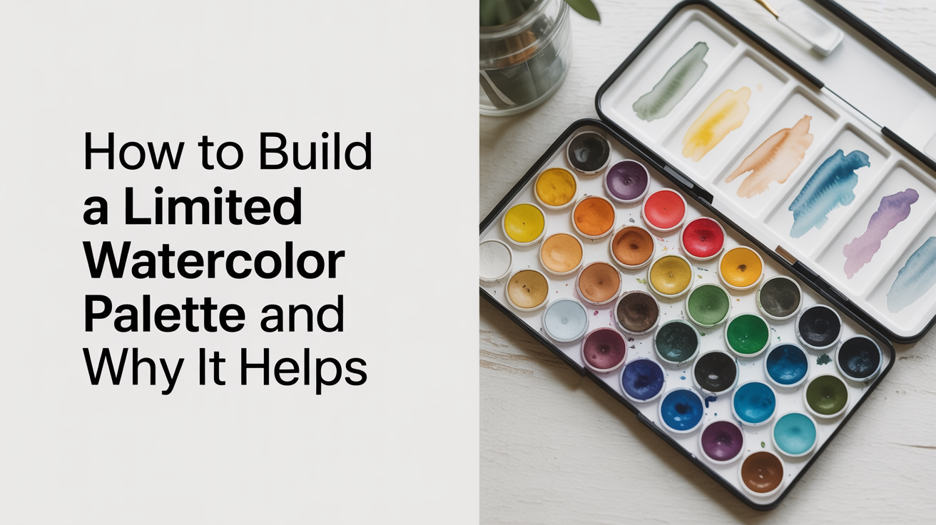
How to Build a Limited Watercolor Palette and Why It Helps
Learn how a limited watercolor palette of 6-8 colors builds color-mixing skill faster than a big box ever could.
Most beginners buy a 24-color pan set and then freeze up every time they open it. A limited palette solves that. When you work with just six to eight carefully chosen colors, you spend less time picking and more time painting, and your mixes start to look intentional rather than muddy.
The idea isn't to deprive yourself. It's to learn what colors can actually do. A tube of phthalo blue and a tube of burnt sienna can produce an astonishing range of darks, neutrals, and near-blacks. Once you've mixed your way through a small palette, buying more colors becomes a real decision rather than a reflex.
Why a limited palette works for beginners
A large palette creates what psychologists call choice overload. Too many options and you pick the color that looks closest to what you want, skip the mixing step, and end up with garish, unrelated hues that fight each other across the paper.
A limited palette forces a different habit. When you only have a warm yellow and a cool blue, you have to mix a green. You notice how much phthalo blue to add before the mixture tips. You start to understand why your foliage looks either too yellow or too turquoise, and you adjust. That's color intuition developing in real time.
There's also a practical harmony benefit. Colors mixed from the same small family share underlying pigments, so they naturally read as belonging to the same painting. Artists call this color harmony. It's one reason landscape painters working outdoors with six tubes produce cohesive work while beginners with a full set often produce paintings that feel cluttered and noisy.
A reliable starter palette: six colors that cover a lot of ground
The classic beginner approach is two primaries in each family: a warm and a cool version of red, yellow, and blue. That gives you six paints total, and from them you can mix a convincing secondary palette plus a full range of earth tones and neutrals.
Here's one well-tested arrangement:
| Color | Pigment | Role |
|---|---|---|
| Hansa yellow (or cadmium yellow hue) | PY3 or PY35 | Warm yellow, lemon-y, good for sunlit greens |
| Yellow ochre | PY43 | Muted warm yellow, earthy tones, skin, dried grass |
| Quinacridone rose | PR122 | Cool red, mixes clean violets and soft oranges |
| Burnt sienna | PBr7 | Warm red-brown, shadows, earth tones |
| Ultramarine blue | PB29 | Warm blue, granulating, good for skies and darks |
| Phthalo blue (green shade) | PB15:3 | Cool blue, very strong, mixes deep neutrals with burnt sienna |
Six paints. Nearly infinite combinations. Note that ultramarine granulates (tiny pigment particles separate and settle into the paper texture), while phthalo blue is a staining dye and stays smooth. Knowing which is which helps you predict a wash before you lay it down.
If you want to add a seventh or eighth color, sap green is a practical choice for anyone painting plants or landscapes. Payne's grey is useful for darkening mixes without the heaviness of black. But start with six and spend a few sessions just mixing swatches before you even paint a subject.
How to choose colors if you already have a set
If you bought a starter kit and want to extract a limited palette from it, don't throw out the extras. Just tape off six wells or squeeze six colors onto a limited area of your palette and work from only those.
Ask yourself three questions about each candidate color:
- Is there another color in this set that does basically the same job? If you have both cerulean and cobalt blue, pick one and put the other away for now.
- Is this color transparent or opaque? Transparent pigments (ultramarine, quinacridone rose, phthalo blue) layer beautifully. Opaque ones (cadmium red, cerulean) sit on the surface and can get muddy in mixes.
- Does it mix clean secondaries with the other five? A quick test: paint a small swatch of each primary mixed with each other. If your yellow-plus-blue mixes go brownish instead of green, one of them is carrying a contaminating pigment and you might swap it out.
Understanding how warm and cool versions of each primary interact is the foundation here. The warm and cool primaries system explains why pairing a warm yellow with a cool blue gives you a different green than a cool yellow with a warm blue. That single idea will change how you evaluate every new color you consider adding.
Practical tips for working with a limited palette
Set up your palette the same way every session
Physical habit matters. If ultramarine is always in the top-left corner and burnt sienna is always bottom-right, your brush goes there without looking. That sounds trivial until you're in the middle of a tricky wet wash and you need your hand to just know where the dark is.
Arrange colors from light to dark, or warm to cool. Either system works. Just pick one and stick with it.
Mix on the palette, not on the paper
Beginners often try to blend colors directly on the painting surface. This works occasionally (wet-into-wet blooms can be beautiful), but for most controlled mixing you want to build the color in a clean well or on your mixing area first, check it on a scrap of the same paper you're using, then apply it.
Watercolor dries 20 to 30% lighter than it looks wet. If a mix looks perfect wet, it will look washed out dry. Learn to mix a shade darker than your target.
Use two water jars
One jar for rinsing your brush (it will get dirty fast), one jar for clean water you pull into mixes. Using one jar means your "clean water" turns the color of weak tea by your third mix, which shifts every wash slightly warm and muddy. Two jars costs nothing and fixes the problem completely.
Keep a scrap sheet of the same paper
Before any wash goes on your painting, test it on the scrap sheet. Check the value (how light or dark it is), let it dry for 30 seconds to see the shift, and then commit to the painting. This habit alone prevents the most common beginner mistake: applying a color that looks right but dries to a whisper.
Building on your limited palette over time
A limited palette is not a permanent restriction. It's a training period. Most artists spend a few months with a small set and then start adding colors deliberately, one at a time, after they understand what's missing.
Common additions after mastering the six-color palette:
- Raw sienna: warmer and more transparent than yellow ochre, beautiful in autumn foliage and golden light.
- Cerulean blue: a granulating opaque blue that makes convincing skies without the intensity of ultramarine.
- Quinacridone gold (or burnt orange): fills the warm-amber gap that ochre doesn't quite reach.
When you do add a color, spend a session just mixing it against your existing six before you use it in a painting. Ask what it does that nothing else does. If the answer is "not much," you don't need it yet.
Mixing natural-looking greens is usually the first real challenge beginners hit, because tube greens often look artificial. Learning to mix natural greens from your primaries is far more useful than buying a second green tube. The short answer: blue quantity controls the value, yellow quantity controls the warmth, and a tiny touch of burnt sienna knocks back the brightness.
Color relationships your limited palette teaches you
Working with six colors over several weeks teaches you to see color relationships that a full set obscures. You start to notice that shadows are rarely gray, they usually lean either warm (burnt sienna) or cool (ultramarine), depending on the light source. You notice that a raw umber mixed from your red and blue looks more natural than a tube brown because it shares the underlying palette of the rest of the painting.
The beginner's watercolor color wheel is worth revisiting at this stage, not as theory, but as a practical map of the mixes you're already making. Seeing that your phthalo blue and quinacridone rose mix to a clean violet because they're both "cool" primaries makes the color wheel click into place in a way that just reading about it doesn't.
Spend an afternoon making a personal color wheel from your actual paints. It takes maybe 45 minutes and tells you more about your specific palette than any chart in a textbook.
Frequently asked questions
How many colors do I really need to get started?
Six is the sweet spot for most beginners. Two reds, two yellows, two blues, each pair balanced warm and cool. That covers the full primary range, mixes convincing secondaries, and leaves you with enough variety to not feel constrained. Three colors is a fun exercise but genuinely limiting. Twenty-four is too many to learn from at once.
Can I use student-grade paints for a limited palette?
Yes, absolutely. The limited palette concept works with any grade of paint. Student-grade paints from brands like Cotman use more filler (extenders), which means some colors look slightly duller in mixes, but the core pigments are the same. When you're learning how phthalo blue behaves with burnt sienna, that relationship holds true in student or artist grade. Upgrade colors one at a time when you notice a specific limitation.
What if my mixes keep going muddy?
Muddy mixes usually have one of three causes. First, too many pigments in one mix (three or more different paints layered wet create mud almost every time). Second, using a dirty brush or dirty water that tints every mix slightly brown. Third, working on a wet layer before it's dry, so the new wash lifts the pigment underneath. Stick to two-color mixes for the first few weeks, keep your jars clean, and let each layer dry fully before adding another.
Do I need to buy new tubes or can I work from pans?
Either works fine. Pans are convenient for travel and quick sessions, tubes give you stronger color faster and are more economical if you use a lot of paint. For learning to mix, tubes have one advantage: you can squeeze out a larger amount and build saturated mixes more easily. If you have a pan set, just wet the pans well before each session and pick up plenty of paint on the brush.
Should I add white to my limited palette?
Most watercolor work doesn't use white at all. You preserve whites by painting around them on white paper, or by leaving areas unpainted. Chinese white is useful for final highlights and opaque corrections, but if you add it too early in your learning it becomes a crutch that muddies transparent passages. Learn to save your whites first. If you need a specific soft light area and haven't saved the white, a small bit of masking fluid before you start is more useful than white paint added afterward.