Color & Mixing
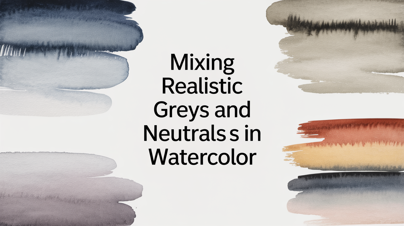
Mixing Realistic Greys and Neutrals in Watercolor
Learn how to mix grey watercolor without black. Discover complementary-colour neutrals, granulating pigments, and a simple warm/cool grey system.
Most beginners reach for black paint the moment they need a grey. It works, sort of, but the result is usually a flat, chalky tone that deadens everything around it. The good news is that mixing greys from colours you already own produces results that feel alive on the paper: warm stone greys, cool slate blues, soft lavenders, and earthy taupes. This guide walks you through the methods that actually work.
Why Skip the Black Tube?
Black watercolour pigment tends to dominate a mix. A small touch greys things down quickly, but the resulting colour often looks like a photocopy of the original, not a believable shadow or neutral tone. More importantly, it separates you from one of watercolour's best features: granulation and optical mixing, where two pigments settle into tiny peaks and valleys on the paper surface, creating subtle texture and life.
A grey made from two complementary colours, or from a warm and a cool pigment, catches the light differently depending on your viewing angle. That small variation is what makes a watercolour painting look luminous rather than painted over.
If you want to understand why warm and cool versions of each primary matter for mixing, warm and cool primaries, the mixing idea that changes everything is worth reading before you try the exercises below.
Method 1: Mixing Complementary Colours
The most reliable way to make grey without black is to mix two complementary colours, the pairs that sit opposite each other on the colour wheel.
Common complementary pairings for greys and neutrals:
| Pair | Result when balanced |
|---|---|
| Ultramarine Blue + Burnt Sienna | Warm grey to neutral dark |
| Ultramarine Blue + Raw Sienna | Soft golden-grey, great for stone |
| Phthalo Blue + Burnt Umber | Cool blue-grey with depth |
| Quinacridone Rose + Viridian | Lavender-grey to neutral violet |
| Cadmium Orange + Cerulean Blue | Soft peach-grey, good for skin shadows |
The key is balance. Lean toward the blue side and the mix reads as a cool grey. Lean toward the warm colour and you get a brown-grey or taupe. Somewhere in the middle you hit a near-neutral.
Start with a puddle of the warmer colour, then add the cooler colour in small amounts until the mix looks grey on a test strip. Dry it before judging: watercolour dries significantly lighter, so your wet mix should look almost too dark.
Method 2: Granulating Pigment Pairs
Some pigments granulate heavily, meaning the particles are large enough to settle into the texture of the paper rather than lying flat. When you pair two granulating pigments, you get a grey that looks almost three-dimensional.
Ultramarine Blue and Burnt Sienna is the classic example, and it earns its reputation. Mix them wet and loosely on the paper rather than thoroughly on the palette. The two pigments separate slightly as they dry, leaving tiny warm and cool flecks that read as a rich grey from a normal viewing distance.
Other strong granulating pairs:
- Ultramarine Violet + Raw Umber
- Manganese Blue + Light Red
- French Ultramarine + Yellow Ochre (leans taupe rather than grey)
You can test granulation by brushing a single pigment across wet paper and watching what happens as it dries. If it clumps into little pools and valleys, it granulates. Mix two granulating pigments and the effect is amplified.
Method 3: A Warm Grey and a Cool Grey System
Rather than mixing each grey from scratch every time, many painters keep two premixed neutral puddles on the palette: one warm grey and one cool grey.
Warm grey: Burnt Sienna + Ultramarine Blue, leaning slightly toward the sienna. This reads as a stone or shadow grey with a brownish undertone. Good for rocks, dry grass, wooden surfaces, and warm shadow areas.
Cool grey: French Ultramarine + a small touch of Burnt Umber, leaning toward the blue. This reads as a slate or overcast-sky grey. Good for cast shadows, cool fog, metal, and distant hills.
From these two puddles you can adjust on the fly: add more blue to cool a shadow, add more sienna to warm a highlight. This saves a lot of palette mixing time mid-painting and gives your greys a consistent feel across the whole piece.
This two-puddle system also pairs well with a limited palette approach. If you keep only a warm and cool version of each primary, your two grey puddles emerge naturally as you work. The guide on how to build a limited watercolor palette and why it helps explains the logic behind keeping fewer paints, which makes grey mixing more predictable.
Neutral Tones Beyond Grey
Grey is not the only neutral in a watercolour painting. Taupes, muted greens, dusty lavenders, and warm beiges all count as neutrals. They share a useful trait: they contain a mixture of warm and cool that prevents them from popping forward aggressively.
Some useful neutrals to experiment with:
- Taupe or warm buff: Yellow Ochre + small amount of Ultramarine
- Muted olive: Raw Sienna + Ultramarine Blue (more sienna than blue)
- Dusty lavender: Quinacridone Rose + Ultramarine Violet, heavily diluted
- Earthy shadow: Burnt Umber + Cerulean Blue (good under skin tones)
These neutrals work well as large background washes because they don't fight with more saturated focal colours. A bright orange flower reads much better against a grey-green background than against a flat grey or a white.
Understanding how these neutrals fit your palette starts with the colour wheel. The beginner's watercolor color wheel made simple shows how to map your paints visually so the complementary relationships become obvious.
Practical Tips for Consistent Results
A few habits make grey mixing more reliable from session to session:
- Test on a scrap first. Mix a small amount of your intended grey and brush it onto the corner of your paper. Let it dry. Only then check if it matches your intention.
- Mix larger puddles than you think you need. Running out of a custom grey mid-painting and trying to remix the exact same tone is very difficult.
- Label your palette notes. Write down rough ratios when you hit a grey you like, even just "2 parts Ultramarine, 1 part Burnt Sienna, lots of water." You will forget otherwise.
- Use clean water. Contaminated water (from rinsing too many colours without refreshing) gives greys a muddy greenish cast that is hard to identify and harder to fix.
- Dilute more than you expect. A grey shadow is rarely the same value as a grey rock. The same mix at different dilutions gives you a range from a very pale misty tone to a near-dark, all from one puddle.
Frequently Asked Questions
Can I use black watercolour at all?
Yes, but treat it as a neutraliser rather than a grey paint. A very small touch of black added to an overly bright colour can knock back its saturation without turning it grey outright. For actual greys in a painting, complementary mixing gives more interesting results.
My mixed greys always look muddy. What am I doing wrong?
Muddy greys usually mean you are mixing more than two pigments together, or using contaminated water, or over-working a wet wash with the brush. Stick to two-pigment mixes, refresh your water often, and lay the wash and leave it alone while it dries.
How much water should I use when mixing greys?
It depends on the value you want. A shadow grey at mid-value needs a moderate amount of water. A light mist or distant haze needs a very watery, pale mix. The pigment ratio stays the same; only the water amount changes. Mix your puddle strong, then dilute test strips to find the right value.
Why does my grey look blue on the paper even though I added plenty of warm colour?
Ultramarine Blue (and most blues) are very staining pigments. They grab the paper fibre quickly and dominate a mix even in small amounts. Try using a slightly less staining blue like Cerulean or Cobalt, or reduce the blue proportion significantly and add it drop by drop to the warm colour rather than the other way around.
What is the best single-pigment grey to keep on hand?
Payne's Gray is the most popular option. It mixes well with other colours and leans cool without being as dominant as black. It is a useful emergency fallback, though it does not granulate or produce the optical texture you get from a two-pigment complementary mix.