Color & Mixing
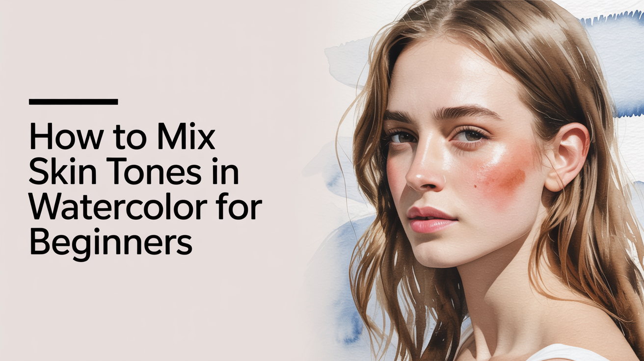
How to Mix Skin Tones in Watercolor for Beginners
Learn how to mix realistic watercolor skin tones for any complexion using a simple limited palette. Practical mixing guidance for beginner portrait painters.
Skin is one of the most satisfying subjects in watercolor, and one that beginners often put off because it feels complicated. The good news is that mixing skin color in watercolor does not require a dedicated "flesh" paint or a special palette. Skin tones are built from the same primaries you already own, and once you understand how they relate to each other, you can mix any complexion you encounter.
This guide walks through that process from the ground up.
Why Skin Tones Feel Hard to Mix
Most beginners assume they need a color labeled "skin" or "flesh" to paint portraits. Those pre-mixed tubes exist, but they tend to look flat and are usually calibrated to one narrow range of complexions. The real challenge is not finding the right tube -- it is learning to see skin as a combination of warm and cool hues that shift depending on the light, the person, and even the time of day.
Skin reads differently in watercolor than in oils or acrylics because the white of the paper acts as your lightest value. You are layering transparent washes of color over that paper white rather than mixing paint toward white. That means thin washes naturally look lighter and more luminous than you expect, which is actually a strength of the medium.
Start with a Simple Three-Color Base
You do not need a large collection of paints to mix believable watercolor skin tones. Most complexions can be reached starting from three pigments:
- A warm yellow: Raw Sienna or Yellow Ochre
- A warm red: Burnt Sienna or Light Red
- A soft blue (for shadow and cooling): Ultramarine Blue or Cobalt Blue
These three colors interact in predictable ways. Mixing your yellow and red in varying ratios gives you a range from pale peachy tones through medium tan and into deep golden brown. Adding a small amount of blue desaturates the mixture and darkens it toward the cooler, more neutral tones you see in shadows.
If your palette already includes Burnt Umber, it is a convenient shortcut for mid-dark skin tones, but it is not required. See how to build a limited watercolor palette and why it helps for more on keeping your paint selection manageable.
Mixing Across a Range of Skin Tones
The table below gives starting ratios for different complexion ranges. These are proportional guides, not rigid recipes. Real skin shifts depending on light, and you will always adjust on the paper.
| Complexion Range | Starting Mix |
|---|---|
| Very fair | Dilute Raw Sienna, tiny touch of Light Red, very little water to keep it pale |
| Light to medium | Raw Sienna + Light Red (2:1), small amount of Ultramarine to neutralize |
| Medium | Burnt Sienna + Raw Sienna (1:1), small amount of blue in shadow areas |
| Medium-deep | Burnt Sienna dominant, Raw Sienna secondary, more blue to deepen shadows |
| Deep | Burnt Umber + Ultramarine Blue, warm yellow accents in highlight areas |
| Very deep | Ultramarine Blue + Burnt Umber (near equal), Burnt Sienna in light zones |
A few things to keep in mind as you work across this range:
- Highlights on deep skin tones are not white -- they are a warm version of the skin color, diluted with water.
- Shadows on fair skin tones often lean cool and slightly violet rather than grey.
- Every person's skin contains multiple temperature shifts. A single flat wash rarely looks believable on its own.
Temperature Shifts: Warm and Cool in the Same Face
This is the idea that makes the biggest difference in portrait painting. Skin is not one color. Even within a single complexion, the areas facing a warm light source look warmer, the areas in shadow look cooler (and often slightly more blue or violet), and transitional zones sit somewhere in between.
A practical method: paint your first wash warm and light across the whole face. While it is still slightly damp, add a cooler, more saturated version of the mix into shadow areas and let it spread naturally. The wet-in-wet blending does the gradation work for you.
Understanding warm and cool primaries helps here. If you mix your shadows using a warm blue like French Ultramarine, you get a deeper, slightly more violet shadow. A cooler blue like Cerulean shifts shadows toward greenish grey. Neither is wrong -- they just suit different lighting conditions. For a deeper look at how warm and cool primaries affect every mixture on your palette, see warm and cool primaries: the mixing idea that changes everything.
Layering and Building Depth
Watercolor works in layers. For portrait painting, that means:
- First wash: dilute and warm, covering the whole face area. Let it dry completely.
- Second wash: add mid-tone areas like the sides of the nose, under the chin, and around the eye sockets. Slightly more pigment, slightly less water.
- Third wash (if needed): darkest shadows, the nostril openings, the crease of the eyelid. Richer pigment, smaller areas.
Each layer should be fully dry before the next goes on, or you risk lifting the wash beneath. A hair dryer set to cool works well if you are impatient.
Reserve the brightest highlights on the forehead, the tip of the nose, and the cheekbone as bare paper. You cannot easily recover that white once it is painted over. Planning your lights before you pick up the brush is a core part of portrait work in watercolor, which connects to the broader beginner's watercolor color wheel made simple -- knowing which colors neutralize each other prevents muddy skin tones.
Avoiding Muddy Mixes
Skin tones go muddy when too many pigments are combined in one go, or when complementary colors (red and green, for example) mix too evenly and cancel each other out. A few habits that help:
- Mix on the palette, not on the paper. Test each mixture on scrap paper before it touches your portrait.
- Keep your mixing area clean. Leftover paint from previous sessions can contaminate new mixes.
- If a mix looks grey and dull on the palette, it will look worse on the paper. Adjust before committing.
- When a shadow needs to be darker, reach for a deeper version of your existing mix rather than adding black.
Frequently Asked Questions
Do I need to buy a premixed flesh tone paint? No. Pre-mixed flesh tones are convenient but limited. Learning to mix skin tones from a warm yellow, a warm red, and a cool blue gives you far more range and teaches you principles that carry over to every other subject you paint.
Why do my skin tones look orange when they dry? Watercolor dries lighter and slightly more muted than it looks when wet. Orange-looking skin often means the mix is too heavy on Burnt Sienna without enough desaturation from a blue. Try adding a small amount of Ultramarine to the mix and check it on scrap paper first.
How do I paint skin tones for very dark complexions? Deep skin tones are built from richer pigment concentrations and often contain more blue in the base mix. Ultramarine Blue and Burnt Umber in roughly equal proportions give a deep, warm brown that works well as a foundation. Add Burnt Sienna for areas catching warm light, and allow the shadows to go quite dark -- deeper complexions have a wider value range than they initially appear.
Should I use Payne's Grey to darken skin tones? Payne's Grey is a convenient darkener but it leans blue-grey, which can make skin look cold and ashen. A better option for darkening skin tones is to deepen your existing warm mixture with more Burnt Umber or a small amount of Ultramarine Blue. Reserve Payne's Grey for neutral shadow areas that genuinely need that cool quality.
Can I paint portraits on cold-press paper? Yes, and most beginners find cold-press easier than hot-press for portraits. Cold-press has a slight texture that holds the paint as you build layers, and it is more forgiving of minor corrections. Hot-press paper gives smoother, crisper edges, which can be useful for detailed work but is less forgiving of soft blending.